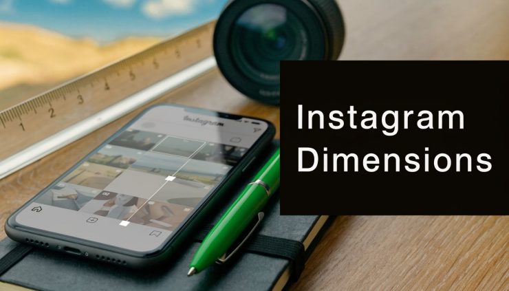
TL;DR: The standard dimensions for an Instagram post are 1080 x 1080 px for square (1:1), 1080 x 1350 px for portrait (4:5), and 1080 x 566 px for a wider format (1.91:1). For Stories and Reels, use 1080 x 1920 px with a 9:16 aspect ratio.
| Content Type | Dimensions (Pixels) | Aspect Ratio |
|---|---|---|
| Square feed post | 1080 x 1080 | 1:1 |
| Portrait feed post | 1080 x 1350 | 4:5 |
| Landscape feed post | 1080 x 566 | 1.91:1 |
| Story / Reel | 1080 x 1920 | 9:16 |
You’re probably here because a post looked right in Canva, Photoshop, or Figma, then showed up cropped, soft, or awkwardly framed once it hit Instagram. That usually isn’t a creative problem. It’s a sizing problem.
When people ask what are the dimensions of an instagram post, they usually want the pixel numbers. Their real need is a workflow that prevents rework. The right dimensions keep the feed clean, the profile grid consistent, and scheduling through Buffer far less frustrating.
Why Instagram Post Dimensions Still Matter in 2026
Instagram still rewards clean presentation. If the image is too small, too tall, or framed without thinking about how it displays in the feed and on the profile, the platform will make decisions for you. Those decisions usually aren't the ones you want.
Instagram started as a square-only platform in 2010, capped at 640 x 640 pixels, then expanded in June 2015 to support portrait and horizontal posts up to 1080 pixels wide. Current guidance recommends a minimum width of 1080 pixels and aspect ratios between 1.91:1 and 4:5, because off-spec uploads can be cropped or downscaled by the platform, which affects how they appear and how visible they are in the feed and grid (Buffer’s Instagram image size guide).
That historical shift matters because many teams still build content as if square is the default. It isn’t. Square is one option. The better question is whether the format supports the asset.
Practical rule: Choose the aspect ratio based on where attention should go. Use portrait when you want more feed real estate, square when consistency matters most, and landscape only when the image truly needs width.
Dimensions also affect speed. A team with locked templates spends less time adjusting assets at the point of scheduling. A team without them ends up fixing crops manually, post by post.
Instagram Dimensions Quick Reference Guide 2026
For day-to-day work, this is the table I’d keep bookmarked alongside a broader social media post dimensions guide.
| Content Type | Dimensions (Pixels) | Aspect Ratio |
|---|---|---|
| Feed post, Square | 1080 x 1080 | 1:1 |
| Feed post, Portrait | 1080 x 1350 | 4:5 |
| Feed post, Landscape | 1080 x 566 | 1.91:1 |
| Story | 1080 x 1920 | 9:16 |
| Reel | 1080 x 1920 | 9:16 |
| Carousel | Match the first slide | Match the first slide |
| Reel cover | Design for 9:16, preview for grid crop | 9:16 |
| Profile photo | Square source, centered for circular crop | 1:1 source |
If you only remember one thing, remember this. 1080 pixels wide is the baseline for almost everything you’ll publish on Instagram.
Detailed Guide to Instagram Feed Post Dimensions

A common workflow problem looks like this. The designer exports one feed graphic, the scheduler loads it into Buffer or EvergreenFeed, and the preview looks fine until the grid crop trims the headline or the post loses impact because the format is too short in the feed. Feed dimensions affect both appearance and production speed, so the right choice starts before anything is scheduled.
Instagram feed posts still fall into three practical options. The smart move is choosing the format based on how the asset needs to perform, not just what size is easiest to export.
Square posts
1080 x 1080 px remains the easiest format to standardize across a team. It works well for quote cards, product shots, simple announcements, and brand templates that need to stay visually consistent from post to post.
The trade-off is screen presence. Square takes up less vertical space than portrait, so it usually earns less attention during fast scrolling.
Square also simplifies approval workflows. If a team is batching content for a month and wants fewer crop checks before loading posts into a scheduler, square is still the lowest-friction option.
Portrait posts
1080 x 1350 px is the default I recommend for many feed campaigns. It gives designers more room for faces, product detail, step-by-step educational graphics, and blog promotion creative without forcing tiny text blocks.
It also tends to perform well because it occupies more of the mobile screen. That matters in real feeds where every extra bit of vertical space helps the post hold attention for another second.
Portrait is usually the best choice for teams publishing through templates. One master file can support stronger in-feed visibility while still being manageable in approval and scheduling workflows. If your team also repurposes the same campaign into short-form video, this guide to Instagram Reel sizing and safe crops helps keep feed creative aligned with vertical assets.
Wide format posts
1080 x 566 px fits images that are naturally broad, such as panoramic shots, certain screenshots, side-by-side comparisons, and video stills with a wide frame. The limitation is straightforward. This format has the smallest on-screen footprint in the feed, so weak creative disappears quickly.
Use wide format only when the image composition depends on width. For general promotions, educational posts, or anything with text, portrait usually gives better room to work.
Here is the practical comparison teams use during planning:
| Format | Best for | Main trade-off |
|---|---|---|
| Square | Quotes, simple graphics, tidy grids | Lower feed presence |
| Portrait | Promotions, people, educational graphics | Needs careful composition for grid preview |
| Wide format | Panoramic visuals, broad scenes, some screenshots | Smallest on-screen footprint |
One more production detail matters. A post can look balanced in the feed and still preview awkwardly on the profile grid, so keep headlines, logos, and faces away from the outer edges. That habit prevents last-minute revisions after the content is already queued.
Use this walkthrough if you want a visual explanation of how feed sizing behaves in real posts:
Mastering Instagram Story and Reel Dimensions
Stories and Reels use 1080 x 1920 px with a 9:16 aspect ratio. That’s the easy part. The harder part is designing so the interface doesn’t cover what matters.

A Reel or Story has to survive multiple layers of UI. Usernames, captions, reply areas, and action buttons can all obscure text if you design edge to edge without planning for safe zones. The practical fix is simple. Keep your headline, logo, and call to action centered well inside the frame, not pinned to the top or bottom.
Safe zone habits that prevent cutoffs
Use these habits when building vertical assets:
- Keep text off the edges: Don’t place key words near the very top or bottom.
- Center the focal point: Faces, products, and visual anchors should sit in the middle area.
- Avoid tiny lower-third captions baked into the design: Platform UI can crowd them out.
- Preview before scheduling: A quick mobile preview catches most mistakes.
Canva notes that Stories and Reels use 1080 x 1920px, and that emerging Meta Quest cross-posting is exploring ultra-HD vertical formats. It also notes that some content gets cut off in VR mode, which scheduling tools can reduce by auto-resizing assets for different environments (Instagram sizing overview from Canva).
If Reels are a major channel for your team, it helps to keep a separate reference for Instagram Reels size requirements.
Dimensions for Carousels Reels Covers and Profile Photos
Some of Instagram’s most annoying formatting issues come from secondary formats, not standard feed posts.
Carousels
The key rule is simple. The first slide sets the format for the rest of the carousel. If slide one is portrait, the rest need to behave like portrait assets. If slide one is square, everything after it needs to fit that square presentation.
That affects planning more than people expect. A carousel mixing quote cards, screenshots, photos, and charts should be designed as one system before export, not assembled from random existing assets.
Reel covers
A Reel cover needs two jobs at once. It should look good as a vertical image, and it should still make sense when cropped in the profile grid preview. That means centered titles, short lines of text, and no critical design elements pushed to the top corners.
The best Reel covers behave like packaging. The full vertical design looks polished, but the center still communicates the topic when Instagram trims the preview.
Profile photos
Profile photos start as square images, but Instagram displays them as circles. The working rule here is composition, not a magic pixel count. Put the logo mark, face, or main symbol in the center with breathing room around it.
A few practical defaults make this easier:
- For brand logos: Use a simplified mark, not a full lockup with tiny text.
- For creators: Crop tighter than you think, but leave space around the face.
- For agencies: Avoid thin outlines and small type that disappear at small sizes.
Recommended File Settings and Export Presets
A post can match Instagram’s pixel dimensions and still come out soft, muddy, or oddly compressed after upload. The failure usually happens at export. Teams design the right canvas, then hand Instagram a file with the wrong color profile, unnecessary weight, or a format that does not fit the asset type.
Use a simple house rule. Export feed assets at 1080 pixels wide, keep the color profile in sRGB, and avoid sending oversized masters to the platform. DPI matters far less than pixel dimensions for screen delivery, so the practical check is whether the exported file matches the intended canvas and stays reasonably light for upload.
Feed export preset
Use this preset for standard feed production:
- Canvas width: 1080 px
- Height: 1080, 1350, or 566 px based on the post format
- Color profile: sRGB
- Resolution setting: 72 DPI
- Format: JPEG for photos, PNG for graphics that need transparency
- JPEG quality: 85 to 95%
There is a trade-off here. Higher quality settings can preserve gradients and skin tones, but they also create heavier files that Instagram will compress again. For most brand posts, a high-quality JPEG in sRGB is the safest middle ground.
Story and Reel export preset
Vertical assets need a separate preset so nobody is resizing feed graphics at the last minute:
- Canvas size: 1080 x 1920 px
- Color profile: sRGB
- Format choice: JPEG for static visuals, video exports matched to the vertical frame
- Final check: Confirm text is readable on a phone before upload
This matters in scheduling workflows. If the creative team exports one approved preset for feed, one for Stories, and one for Reels, tools like EvergreenFeed and Buffer become much easier to use because the asset is already in the correct shape before it enters the queue. That cuts down on manual cropping, duplicate uploads, and approval-round fixes.
Set these presets once in the design tool your team already uses. In Photoshop, save export presets. In Canva, lock branded templates to fixed dimensions. In Figma, use fixed frames with named export settings. That small setup step saves time every week and keeps published posts visually consistent.
Common Instagram Sizing Pitfalls and How to Avoid Them
The most common mistake isn’t using the wrong number. It’s assuming Instagram will fix the asset without consequences.

Hootsuite benchmark data cited in Instagram help material indicates that non-compliant aspect ratios, such as vertical posts taller than 4:5, can cause black bars or up to 30% crop loss, and that can reduce video completion rates by 12%. The same source notes that compression tends to favor high-contrast edges in 1080 x 1350px portraits, improving feed visibility by 8 to 10% (Instagram help reference).
Pitfall one, uploading oversized originals
Teams often export a huge master file and let Instagram shrink it. That gives the platform more work to do and creates more chances for compression artifacts. Resize first.
Pitfall two, designing past the aspect ratio
A post that’s slightly too tall or too wide can still upload, but the presentation gets messy. That’s when you see cropped headlines, clipped products, or black bars.
Pitfall three, forgetting the grid preview
Designers often judge only the full post view. The audience also sees the profile grid. If titles or faces sit too close to the edges, the profile can look inconsistent even when the feed post itself is technically correct.
Use this quick checklist before publishing:
- Match the format first: Choose square, portrait, horizontal, or vertical before designing.
- Export to the final width: Don’t hand Instagram a giant source file and hope for the best.
- Check contrast on mobile: Sharper edges usually survive compression better.
- Preview the crop: Look at feed view and grid view before scheduling.
How to Prepare Assets for EvergreenFeed and Buffer
A key operational win comes from standardizing assets before they ever reach the scheduler. If your team stores platform-ready graphics by content type, scheduling becomes routine instead of corrective.
A practical system is to create content buckets with predefined formats. Quotes can stay square for visual consistency. Blog promos, educational graphics, and testimonials usually perform better as portrait assets because they use more vertical space. Reels and Stories get their own vertical template set.
For teams using Buffer in a recurring publishing workflow, this matters because pre-sized assets reduce manual fixes during scheduling. If you’re managing evergreen buckets through a tool like this Buffer scheduling workflow guide, having fixed dimensions per content category keeps the queue clean and predictable.
Build the template library once. Then make content fit the system, not the other way around.
That’s the difference between a content operation that scales and one that keeps redoing assets at publish time.
Frequently Asked Questions About Instagram Dimensions
Is 1080 x 1350 better than 1080 x 1080?
Usually, yes for feed posts. Portrait gives you more on-screen presence. Square still works well when visual consistency matters more than maximum feed space.
What happens if I upload a 4K image?
Instagram will still process it to fit its own display rules. In practice, it’s better to export at the final intended width rather than relying on platform compression to do the resizing for you.
Can I mix dimensions in one carousel?
Not effectively. The first slide determines the carousel’s display format, so mixed aspect ratios usually create awkward cropping or borders.
Are Story and Reel dimensions the same?
Yes. Both use 1080 x 1920 px in a 9:16 format. The difference is less about canvas size and more about how the content is consumed and where interface elements appear.
What’s the safest all-purpose Instagram format?
For feed content, 1080 x 1350 px is the most reliable default for visibility. For short-form vertical content, use 1080 x 1920 px.
Why does text get cut off even when my size is correct?
Because dimensions and safe placement aren’t the same thing. You can use the right canvas and still lose text if it sits too close to interface-heavy areas or crop-prone edges.
Should I use PNG or JPEG?
Use JPEG for most photos and promotional graphics. Use PNG when you need transparency or your design includes sharp graphic elements that benefit from that format.
If you want a cleaner repeatable publishing process, EvergreenFeed helps you organize social posts into buckets and send them through Buffer on a schedule, which is much easier when your Instagram assets already follow fixed dimensions by content type.