
Great metrics and reporting are what turn a flood of business data into a clear, actionable roadmap for growth. They’re the difference between guessing what works and knowing precisely which levers to pull to improve performance, bringing strategic clarity to what often feels like scattered information.
Moving from Data Chaos to Strategic Clarity

Do you ever feel like you're drowning in spreadsheets but still have no idea which way to steer the ship? You’re not alone. So many businesses get stuck in "analysis paralysis," where having too much data just leads to confusion, not confidence.
The issue isn't a lack of information. It's the lack of a smart, structured approach to your metrics and reporting.
Think of it this way: good reporting isn’t about vacuuming up every possible data point you can find. It’s about asking the right questions first. Your business is a complex machine, and without the right gauges on the dashboard, you can't tell if it's running smoothly, overheating, or about to sputter out. Metrics are those gauges, and a solid report is the dashboard that makes them easy to read.
The Power of a Clear Narrative
A strategic approach to reporting doesn't just give you numbers; it tells you a story about your business's health. It goes beyond showing you what happened and helps you understand why it happened—and what to do next. This is how you cut through the noise and zero in on what truly matters.
When you frame your data as a story, you can easily spot the plot (your business goals), the characters (your customers and team), and the turning points (key trends and insights). This narrative makes complex information digestible and actionable for everyone, not just the data nerds.
This simple shift in perspective is what turns your data from a source of stress into a tool for making confident decisions. By building a solid framework, you create a reliable compass that guides every strategic move, revealing opportunities for growth that were previously buried in the chaos.
This foundation helps you:
- Prioritize Efforts: Focus your team's energy and budget on the activities that actually move the needle.
- Identify Trends: Spot emerging patterns in customer behavior or market shifts long before your competitors do.
- Improve Accountability: Set clear, measurable goals and track progress without the guesswork.
- Foster a Data-Informed Culture: Empower your entire team to make smarter choices based on evidence, not just gut feelings.
Ultimately, mastering your metrics means you stop reacting to what happened last quarter and start proactively shaping the future.
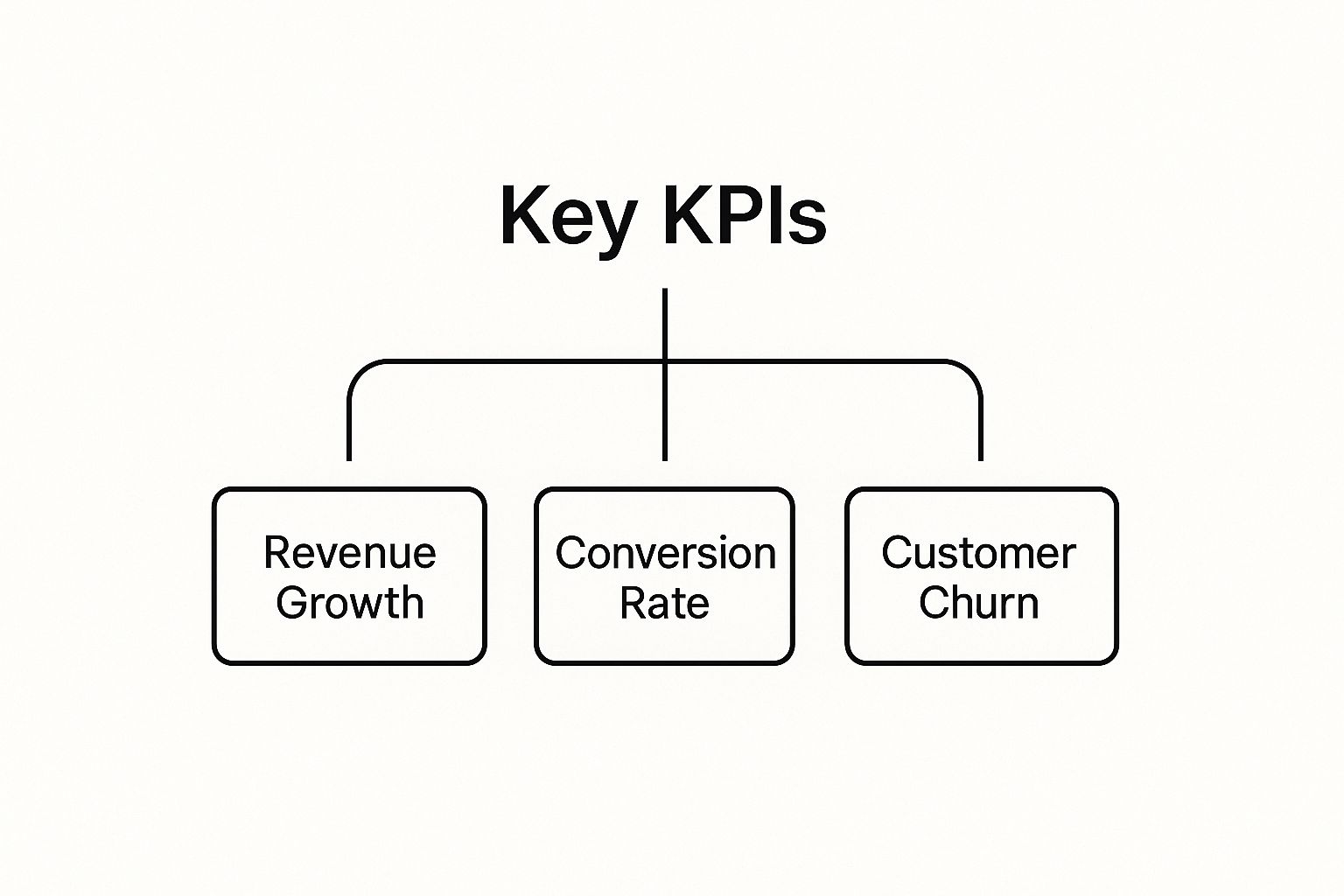
Choosing Metrics That Actually Matter
Before you can build a report that anyone cares about, you have to figure out what’s actually worth measuring. This is the first, and most common, stumbling block for a lot of businesses. We get so caught up in numbers that look impressive on the surface but don't really say anything about the health of the company. Great metrics and reporting start by cutting through that noise—moving past "vanity metrics" and zeroing in on the Key Performance Indicators (KPIs) that truly drive your business forward.
Think of it like flying a plane. A pilot can't just stare at the altimeter and call it a day. They need a whole dashboard of instruments—airspeed, fuel level, engine temperature, heading—to get a complete picture and make smart decisions. Your business is no different. Relying on a single metric is like flying blind.
To get that full cockpit view, you need to track metrics across three core areas of your business:
- Financial Metrics: These are the vitals, like profit margin and revenue growth. They tell you if the business is financially stable and sustainable.
- Customer Metrics: Things like churn rate and customer lifetime value (CLV) tell you how happy your customers are and what they're worth to you over time.
- Operational Metrics: This is about how smoothly the engine is running. Think process efficiency or your lead-to-close ratio.
When you look at these together, you get a clear, honest picture of your performance, which stops you from making big decisions based on a small piece of the story.
Aligning KPIs With Business Goals
The most powerful metrics are the ones you can draw a straight line from to your most important business goals. It's that simple. If your top priority is to expand your market share, then new customer acquisition is your North Star KPI. If profitability is the name of the game, then you'll live and breathe numbers like customer acquisition cost (CAC) and profit margin.
Without this direct link, you're just tracking numbers for the sake of it. They might be interesting, but they won't help you win.
This hierarchy is a great reminder that while there are countless things you can track, only a handful of top-tier KPIs give you a clear signal on overall performance. The trick is to tie everything back to your main strategy. For instance, your social media efforts should have their own specific metrics that directly feed into these bigger business goals. If you need help with that, check out our guide on https://www.evergreenfeed.com/blog/how-to-create-a-social-media-plan/.
A metric tells you what happened. A KPI tells you if what happened actually mattered for achieving your goals. Don't confuse activity with progress.
As we move through 2025, the ability to track the right business growth metrics is no longer optional—it's essential for survival in crowded markets. These indicators are the vital signs for your company's health. They give leaders the hard data needed to see what's working, where to put resources, and how to spot trouble before it spirals. Today, data-driven decisions aren't just a buzzword; a company's success is directly tied to how well it can read and react to its own data.
A Practical Framework For Selecting Your KPIs
Okay, so how do you actually pick the right metrics from the hundreds of possibilities? Instead of getting overwhelmed, just run any potential KPI through this simple four-question filter:
- Does this connect to a major business goal? If you can't tie it back to a top-level objective, it’s probably not a KPI.
- Can we actually do anything about this number? A good KPI is one your team can directly influence through their work.
- Is it easy to understand? If you have to explain it for five minutes, it’s too complicated. Everyone on the team should get it.
- Can we track it reliably? The most brilliant KPI in the world is useless if the data is messy or impossible to collect consistently.
To give you a clearer idea of where to start, we've broken down some of the most common and valuable metrics by business function.
Essential Business Metrics by Category
This table breaks down key performance indicators across different business functions, helping you identify which metrics are most relevant to your goals.
| Metric Category | Key Metric Example | What It Measures | Why It Matters |
|---|---|---|---|
| Financial | Profit Margin | The percentage of revenue that becomes profit. | Shows overall financial health and pricing efficiency. |
| Sales | Lead-to-Close Ratio | The percentage of leads that become paying customers. | Indicates the effectiveness of your sales process. |
| Marketing | Customer Acquisition Cost (CAC) | The total cost to acquire a new customer. | Determines the profitability and scalability of marketing campaigns. |
| Customer Success | Churn Rate | The percentage of customers who cancel their subscription. | Reveals customer satisfaction and product-market fit. |
| Operational | Employee Productivity | The output produced per employee over a specific time. | Measures internal efficiency and resource management. |
This isn't an exhaustive list, but it's a solid starting point for building a dashboard that gives you a holistic view of your business's performance.
To see how these concepts play out in the real world, especially in a service-based industry, tools like a Legal Marketing ROI Calculator can be incredibly insightful. They show you exactly how raw data connects to real financial outcomes—which is the entire point of a strong reporting system. By sticking to a disciplined framework like this, you can be sure that every number on your dashboard is sending a clear, actionable signal that helps you grow.
Building Reports That Tell a Compelling Story

Once you’ve nailed down the right metrics, the real challenge begins: presenting them in a way that actually means something. Let's be honest, a spreadsheet full of numbers is just noise. A great report isn't a data dump; it’s a story that guides smart decisions.
Think of yourself as a translator. Your job is to take raw, messy data and turn it into a clear, compelling narrative that inspires action. This means going beyond just picking a few pretty charts and really embracing the art of storytelling with data.
From Data Points to Plot Points
Every good story has a beginning, a middle, and an end. Your reports should, too. This simple structure makes complex information so much easier for people to follow and, more importantly, remember.
Here’s how to frame your report like a story:
- The Hook (The Beginning): Lead with your biggest finding. Don't bury the headline! Start with the most surprising trend or the most important takeaway to grab your audience's attention right away.
- The Context (The Middle): This is where you answer "so what?" Compare this month's performance to last month's, or stack it up against industry benchmarks. This is what gives the numbers meaning.
- The Resolution (The End): Wrap up with clear, actionable recommendations. Based on what the data shows, what should the team start, stop, or continue doing?
This approach turns a dry report into a powerful tool. Instead of just stating a 3.4% increase in engagement, you're explaining why it happened and outlining a clear path to replicate that success.
Know Your Audience and Tailor the Tale
The story that gets your CMO excited will probably put your social media manager to sleep. A huge part of effective reporting is knowing who you're talking to and customizing the level of detail. You wouldn't give a film critic and your best friend the same movie review, right?
Think about these two common audiences:
- For Executives (The High-Level Summary): They need the big picture, and they need it fast. Focus on the money metrics—ROI, customer acquisition cost, and overall brand lift. Keep visuals clean and the narrative focused on business impact.
- For Operational Teams (The Detailed Dashboard): This crew lives in the weeds and needs the granular data to do their jobs. Give them the deep dive on campaign performance, click-through rates by platform, and daily engagement metrics. This is where interactive dashboards are a lifesaver.
The goal isn't just to present data; it's to provide the right insights to the right people at the right time. A successful report empowers each person to make better decisions in their role.
Visualizing the Story for Maximum Impact
How your data looks is just as important as what it says. Good data visualization makes complex information easy to grasp in a second. Bad visualization just creates confusion and can even lead to the wrong conclusions.
You don’t have to be a graphic designer, but a few basic principles go a long way.
A line chart is perfect for showing a trend over time, like follower growth over a quarter. A bar chart is great for comparing different categories, like engagement across Facebook, Instagram, and TikTok. For anyone trying to build an audience, these kinds of visuals are key to many content marketing hacks to grow your blog.
By choosing your visuals wisely and structuring your report as a story, you transform your metrics and reporting from a chore into a strategic asset. You’re not just crunching numbers; you’re providing clarity and empowering your whole team to move forward with confidence.
From Theory to Action: Building Your Reporting System
You've figured out what to measure and how to report it. That’s a huge first step. But a plan on paper doesn't do much on its own. The real magic happens when you turn that strategy into a living, breathing system that feeds you insights automatically.
Gone are the days of wrestling with spreadsheets and manually copying data from a dozen different places. Modern tools can build a single source of truth for you, doing all the heavy lifting. This frees you up to do what you do best: analyze, strategize, and make smart decisions.
Connecting the Dots: Unifying Your Data Sources
Think about all the places your business data lives right now. Your CRM holds customer info, your marketing platform has campaign stats, and your financial software tracks the money. They’re like separate islands. A great reporting tool is the bridge that connects them all, letting information flow freely.
This is where platforms like EvergreenFeed come in. They’re built to plug right into the tools you already use, creating a single, unified view of your entire operation. When your sales, marketing, and customer success data all talk to each other, you can finally see the whole picture.
Suddenly, you can answer the big questions:
- Which marketing channels actually bring in our best customers?
- Does social media engagement really lead to a higher customer lifetime value?
- What’s the real ROI on all the content we’re creating?
Trying to answer these without a connected system is a nightmare of manual work and potential errors. With everything integrated into one dashboard, the answers are right there at your fingertips.
Building Your First Automated Dashboard
With your data sources connected, it's time to build your first dashboard. Don't try to cram every metric you can think of onto one screen—that just creates noise. The goal is a clean, simple view that highlights the most critical KPIs you picked out earlier.
Start small. Focus on one key area of the business, like lead generation or customer retention. For a social media manager using EvergreenFeed, a great first dashboard might track the performance of their evergreen content strategy.
The screenshot above shows how EvergreenFeed helps organize content into different "buckets" with an automated schedule. A dashboard built around this workflow would translate that activity into results. You could instantly see which content categories get the most engagement, drive the most clicks, and grow your audience over time—no guesswork needed.
Business Intelligence for Everyone
This whole idea—easily connecting data and building automated reports—is part of a huge shift in the business world. The Business Intelligence (BI) market is absolutely exploding. It’s projected to grow from $36.82 billion in 2025 to an incredible $116.25 billion by 2033.
Why the massive growth? Because data tools are no longer reserved for giant corporations with teams of analysts. You can find more details on these BI trends at sranalytics.io.
User-friendly platforms have put the power of data into everyone's hands. You don't need to be a data scientist to build a report that tells you something meaningful. Tools like EvergreenFeed empower marketers and founders to take ownership of their metrics.
A modern reporting platform doesn't just show you data; it gives you back your time. Automation handles the repetitive tasks, so you can focus on the high-value work of interpreting insights and making strategic moves.
This is a fundamental change. Reporting is no longer about looking in the rearview mirror to see what happened last month. It's about looking at the road ahead and using real-time data to steer your business where you want it to go. By putting an automated reporting strategy into action, you create a powerful feedback loop that constantly improves everything you do.
Turning Your Insights into Smarter Decisions

Let’s be honest: a dashboard full of beautiful charts is nice, but it's only half the battle. The real magic of metrics and reporting isn't just in the data you collect—it's in the smart, timely decisions that data helps you make. This is the moment you graduate from being a data collector to a genuine strategist.
The trick is to look past the surface-level numbers. It’s about digging into the why behind every metric to spot hidden trends, uncover new opportunities, and snuff out small problems before they become major headaches.
Avoiding Common Analytical Traps
One of the biggest hurdles I see people face is falling for common misinterpretations. These analytical traps can send your team sprinting in the wrong direction, wasting precious time and money on "solutions" that don't even address the real issue.
Two of the most dangerous traps are:
- Confusing Correlation with Causation: This is a classic. Just because two numbers move together doesn't mean one is causing the other. For instance, your ice cream sales and social media engagement might both spike in July. That doesn’t mean your posts are selling ice cream; the summer heat is likely the real driver for both.
- Chasing Vanity Metrics: We've touched on this before, but it bears repeating. Tracking metrics like total followers feels good, but they rarely connect directly to your business goals. Focusing on them can lead you to celebrate false wins while your actual bottom-line indicators, like customer lifetime value, are quietly declining.
These slip-ups show why a deeper level of thinking is so critical. Getting the fundamentals of data interpretation right is one of the most important things you can do. For a deeper dive, check out our comprehensive guide on the dos and don'ts of digital marketing.
The "Five Whys" Framework for Deeper Insights
To get to the heart of an issue, you don’t need a complicated process. All you need is a simple but incredibly powerful framework. Toyota famously pioneered the "Five Whys" technique, a method where you just keep asking "why?" until you uncover the true root cause of a problem.
Here’s how it works in a real-world social media scenario:
- The Observation: Our website referral traffic from social media dropped by 20% last month.
- Why? Because our click-through rate (CTR) on posts with links took a nosedive.
- Why? Because our posts with the highest reach were image-based quotes, which don't have any links.
- Why? Because our new content strategy was designed to maximize engagement (likes and shares) over driving traffic.
- Why? Because we were chasing a vanity metric (engagement rate) instead of our primary goal (getting people to read our blog).
Root Cause: Our social media strategy became misaligned with our actual business objective. The problem wasn't the algorithm or the content itself—it was the goal we were optimizing for.
This simple exercise turns a vague problem ("traffic is down") into a precise, actionable insight ("we need to rebalance our content to include more link-focused posts"). It’s a foundational practice for building a culture where data-informed improvement becomes second nature.
Translating Data Into Strategic Actions
Once you've found the root cause, the final step is turning that insight into a concrete plan of attack. Vague takeaways like "we need to improve" are useless. A good reporting cycle always ends with specific, actionable next steps.
Building this skill is more important now than ever. The global Big Data analytics market is forecasted to hit a staggering $549.73 billion by 2028. And with 75% of the global population expected to interact with data daily by 2025, the need for robust metrics and reporting to make sense of it all has become non-negotiable.
To make sure your insights always lead to action, try framing them this way:
- Insight: State the core learning from your analysis. (e.g., "Our video content drives twice the engagement of our static images.")
- Recommendation: Propose a specific action based on that insight. (e.g., "Let's allocate 15% more of our content budget to video production next month.")
- Hypothesis: Frame the expected outcome as a testable prediction. (e.g., "If we do this, we believe we can increase our overall engagement rate by 10% next quarter.")
By consistently using this structure, you create a powerful feedback loop. Every report doesn't just show what happened—it actively makes your strategy smarter, stronger, and more effective over time.
Frequently Asked Questions About Metrics and Reporting
Let's be honest: navigating the world of metrics and reporting can feel like learning a new language. You hear terms like "KPIs" and "data-driven" tossed around in meetings, but turning those buzzwords into an actual strategy can feel… murky.
This FAQ is here to cut through the noise. We'll tackle the most common questions that come up when teams start getting serious about their data, with practical, no-nonsense answers.
What Is the Difference Between a Metric and a KPI?
This is probably the single most common question, and the answer is crucial for focusing your team's energy.
Think of it like you're on a long road trip. You have a dashboard full of numbers: your current speed, the engine temperature, how much gas is left, what song is playing. All of those are metrics—they're just data points.
But a Key Performance Indicator (KPI) is the big number on your GPS: your estimated time of arrival. It's the one metric that tells you if you're actually on track to reach your most important destination.
To put it simply: All KPIs are metrics, but not all metrics are KPIs. A KPI is a metric that’s tied directly to a critical business goal.
For example, you might track website visits and social media likes. Those are fine metrics. But if your main goal is to increase sales, your real KPIs are numbers like customer acquisition cost or monthly recurring revenue. They measure real progress, not just activity.
How Often Should I Review My Business Reports?
There’s no magic number here. The right reporting schedule depends entirely on who’s looking at the report and how fast your business moves. The key is to match the report's timing to the decisions it's supposed to help make.
It's a bit like checking the instruments on a plane:
- Daily or Weekly (Operational): Your front-line teams—like social media managers or sales reps—need a constant pulse on what's happening. They're looking at operational metrics like post engagement or new leads to make quick adjustments to their daily work.
- Weekly or Monthly (Tactical): Team leads and managers need a slightly longer view. They're reviewing things like campaign performance to decide where to allocate resources for the next few weeks.
- Quarterly (Strategic): Senior leadership is focused on the big picture. They’re tracking strategic KPIs like profitability and market share to guide long-term planning and major business decisions.
The goal isn't just to create reports; it's to get the right data to the right people at the right time.
What Are Vanity Metrics and Why Are They Dangerous?
Vanity metrics are the numbers that look amazing in a presentation but don't actually mean anything for the business. They feel good to report, but they don't help you make smarter decisions.
Think of classic examples like total social media followers or total app downloads. Sure, the numbers might go up, but they can be dangerously misleading because they have no direct connection to revenue, customer satisfaction, or real growth.
The danger is that you end up optimizing for the wrong thing. If you spend all your time and money trying to boost your follower count, you might succeed. But if none of those new followers ever click, buy, or engage with your brand in a meaningful way, did you actually win?
The antidote to vanity metrics is a relentless focus on actionable metrics. An actionable metric is any piece of data that helps you make a specific, informed business decision.
So instead of just tracking total page views (vanity), you should track the conversion rate per traffic source (actionable). That tells you which of your marketing channels are actually working, so you can do more of what's effective and stop wasting money on what isn't.
How Can I Build a Data-Driven Culture?
This is where so many companies get stuck. Building a data-driven culture isn't a tech problem—it's a people problem. You can have the fanciest dashboards in the world, but if your team isn't encouraged to use them, they're just expensive decorations.
It really comes down to changing habits and mindsets, starting from the top.
Here are four practical steps:
- Lead by Example: Culture change starts with leadership. When executives consistently use data to explain their decisions, it sends a powerful signal that evidence trumps opinion.
- Make Data Accessible to Everyone: Don't lock your data away in a team of analysts. Use user-friendly tools and dashboards to get key numbers into everyone's hands. When people can see the impact of their own work, they start thinking like owners.
- Invest in Data Literacy: Not everyone needs to be a data scientist, but everyone should be able to read a report and ask good questions. Offer simple training on what your company’s core KPIs mean and how their work connects to them.
- Celebrate the Wins: When a team uses data to make a smart decision that leads to a great result, shout it from the rooftops! Sharing those stories creates a positive feedback loop that makes everyone want to get on board.
Ready to stop guessing and start growing? With EvergreenFeed, you can automate your social media scheduling and get clear insights into what content performs best, saving you hours while boosting your engagement. Start your free trial today and see the difference data can make!