In the fast-paced world of social media, visual content is king. But a stunning graphic or compelling video can fall completely flat if it's cropped awkwardly, stretched, or appears pixelated. Getting your social media post dimensions correct is not just a minor technical detail; it is a critical component of a successful content strategy. The right specifications ensure your message is displayed perfectly on every device, from wide desktop monitors to vertical mobile screens, maximizing its visual impact and boosting engagement. An incorrectly sized image can signal a lack of professionalism and undermine your brand's credibility before a user even reads your caption.
This guide eliminates the guesswork. We have compiled the definitive, up-to-date roundup of the most crucial image and video dimensions you need to master. This is your comprehensive blueprint, covering every major platform and format, from Instagram Stories and TikTok videos to professional LinkedIn updates and eye-catching Facebook cover photos.
Key Takeaway: Using the correct social media post dimensions is the foundational step to ensuring your content is seen as intended, protecting your brand's quality, and optimizing performance across all platforms.
Whether you are a seasoned social media manager, a freelance content creator, or a small business owner handling your own marketing, this cheat sheet will become your go-to resource. Forget searching for individual specs every time you create a post. Here, you will find all the essential information in one place, complete with actionable tips to help you create polished, effective visuals that capture attention and drive results every single time. Let's dive into the precise dimensions that will make your content shine.
1. Instagram Square Post
The classic 1:1 square post is the original format that defined Instagram's aesthetic and remains a cornerstone of effective social media post dimensions. With a recommended resolution of 1080×1080 pixels, this format ensures your content appears balanced, consistent, and visually appealing across all user feeds, from the main timeline to the profile grid. Its symmetrical nature makes it incredibly versatile for a wide range of content types.
Why Use a Square Post?
The primary benefit of the 1:1 aspect ratio is its predictability. Unlike vertical or horizontal formats that might get cropped in certain views (like the profile grid), the square post maintains its full composition everywhere. This makes it ideal for brands focused on creating a perfectly curated and cohesive grid aesthetic. For example, major brands like Nike and Starbucks frequently use square posts for product reveals and promotional graphics, ensuring their profile page looks polished and professional.
Actionable Tips for Square Posts
To maximize the impact of your square images, follow these key practices:
- Center Your Subject: Place the most critical visual elements and text near the center of the frame. This creates a clear focal point and prevents important details from being overlooked as users scroll quickly.
- Use High-Contrast Elements: Since most users view Instagram on mobile devices with varying screen sizes and brightness levels, high-contrast colors and bold typography are crucial. This ensures your message is legible and your visuals pop, even on a small screen.
This quick reference box summarizes the core social media post dimensions for the classic Instagram square.
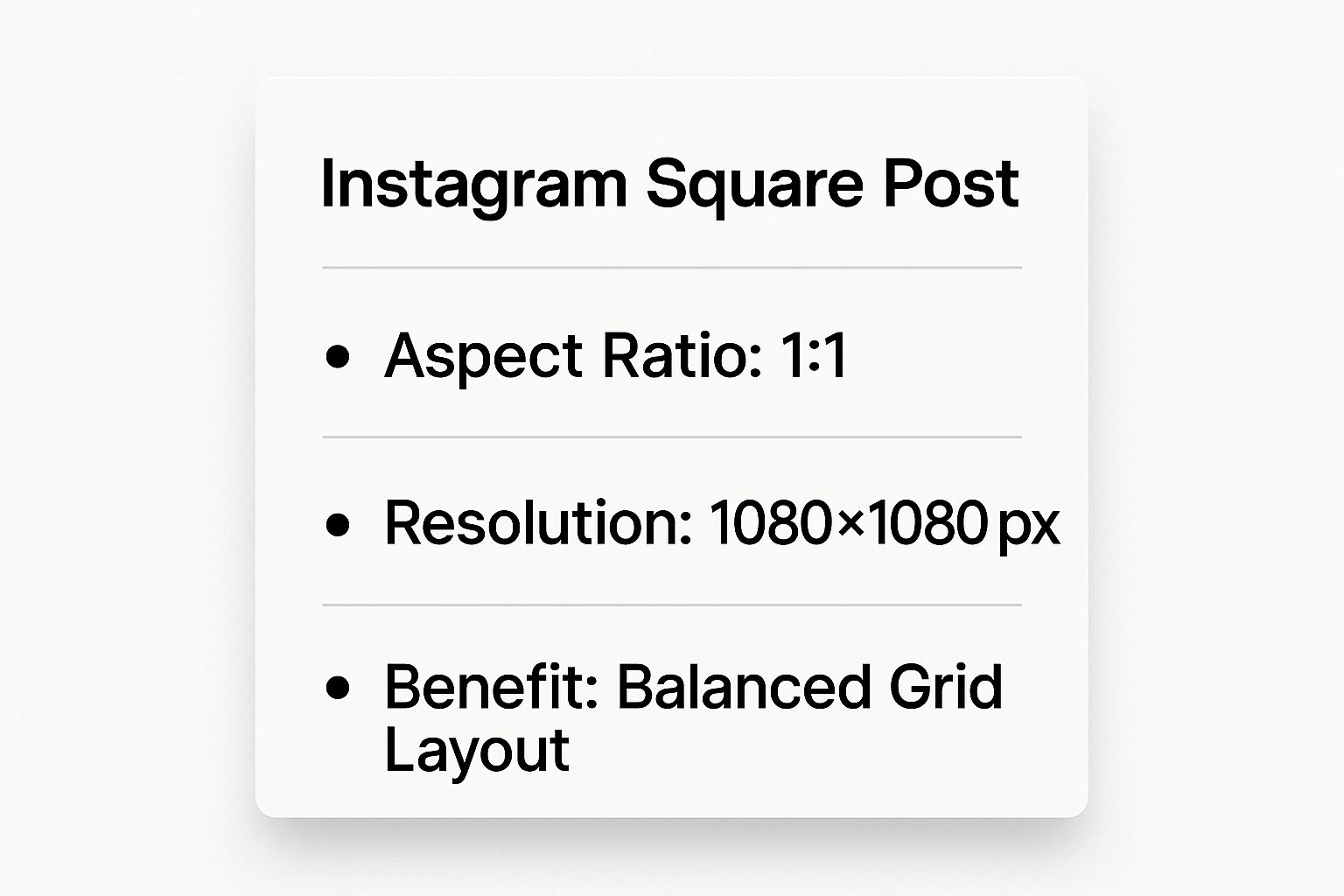
As the infographic highlights, adhering to the 1:1 aspect ratio and 1080×1080 resolution is fundamental for achieving that sought-after balanced grid layout. Mastering this format is a crucial first step for anyone looking to build a strong visual identity on the platform. To further enhance your engagement, you can learn more about getting likes on Instagram.
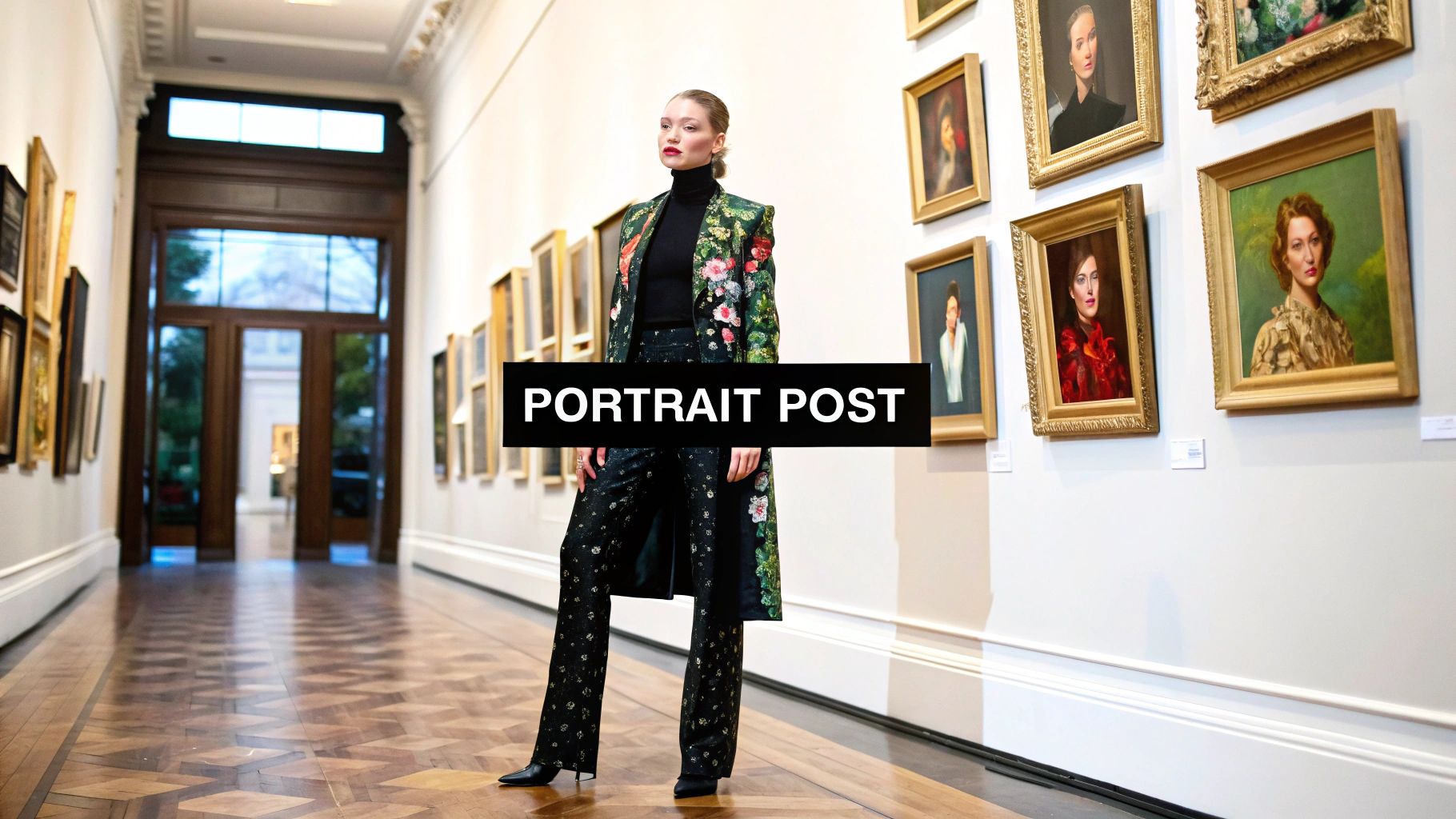
2. Instagram Portrait Post
The vertically oriented portrait post, with a recommended 4:5 aspect ratio and a resolution of 1080×1350 pixels, is a powerful tool for capturing audience attention. This format maximizes screen real estate on mobile devices, allowing your content to occupy more of the user's feed as they scroll. Its taller frame is perfectly suited for showcasing subjects that benefit from a vertical presentation, making it a favorite for visually driven niches.
Why Use a Portrait Post?
The primary advantage of the 4:5 format is its ability to dominate the mobile feed, which can lead to higher engagement rates. By taking up more vertical space, it reduces the visibility of competing posts, holding the user's focus for a longer duration. This makes it an exceptional choice for content where detail and scale are important. For instance, fashion influencers like Chiara Ferragni often use portrait posts to display full-length outfits, while photographers leverage the format for impactful close-ups that highlight intricate details. It’s a key part of an effective strategy for optimizing social media post dimensions.
Actionable Tips for Portrait Posts
To get the most out of your vertical images, keep these best practices in mind:
- Mind the Grid Crop: While the portrait post shines in the feed, Instagram automatically crops it to a 1:1 square for your profile grid. Ensure your main subject is centered horizontally and vertically so it remains visually appealing in the grid view.
- Guide the Viewer's Eye: Use leading lines and composition techniques to draw the viewer's eye up or down the image. This encourages them to pause and absorb the entire visual, rather than quickly scrolling past. A well-composed vertical shot feels immersive and intentional.
- Test Your Composition: Before publishing, consider testing how your image will crop on a secondary or test account. This quick check ensures that no crucial elements are lost in the profile grid view, helping you maintain a cohesive and professional aesthetic across your entire Instagram presence.
3. Instagram Story & Reel
Full-screen vertical content has become a dominant force in social media, and the Instagram Story & Reel format is at its epicenter. Using a 9:16 aspect ratio with a recommended resolution of 1080×1920 pixels, this format provides an immersive, edge-to-edge viewing experience. Originally popularized by Snapchat and now a staple on Instagram and TikTok, it’s the go-to for ephemeral Stories and engaging, short-form Reels.
Why Use a Story or Reel?
The primary advantage of the 9:16 vertical format is its ability to capture a user's full attention by occupying their entire mobile screen. This makes it exceptionally powerful for storytelling, tutorials, and behind-the-scenes content. Brands like Sephora master this by using Stories for interactive makeup tutorials with clickable product tags, while high-fashion brands such as Gucci leverage Reels to launch engaging AR filters, creating a viral loop of user-generated content that boosts brand visibility. This format feels native to the mobile experience, leading to higher engagement rates.
Actionable Tips for Stories & Reels
To create effective vertical content that truly connects, implement these strategic tips:
- Respect the Safe Zone: Keep essential elements like text, logos, and calls-to-action away from the very top and bottom. The Instagram interface (username, comment fields, etc.) can obscure your content, so leave a margin of roughly 15% at the top and bottom to ensure nothing critical is covered.
- Design for Sound-Off Viewing: A significant portion of users watch videos without sound. Add subtitles or captions to all speaking parts and use bold, clear on-screen text to convey your key messages. This ensures your content is accessible and understandable to the widest possible audience.
This video provides a great visual guide on creating compelling Reels that align with these social media post dimensions.
As the video demonstrates, mastering the 1080×1920 pixel format is key to producing professional-looking Reels and Stories that stop the scroll. By designing for the full-screen experience while keeping UI elements in mind, you can create immersive content that drives deeper audience connection and engagement.
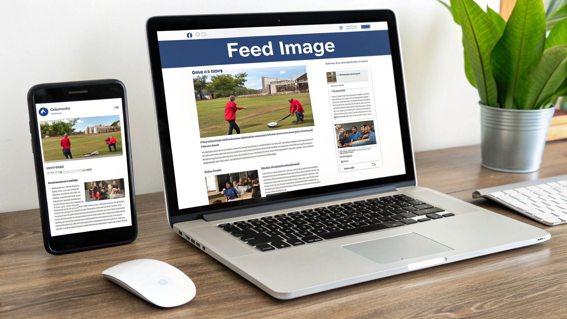
4. Facebook Feed Image
The horizontal feed image is a foundational element of Facebook content strategy, optimized for how users consume information in the News Feed. With a recommended resolution of 1200×630 pixels and a 1.91:1 aspect ratio, this format is the standard for shared links and standalone image posts, ensuring your visuals display correctly across both desktop and mobile devices without awkward cropping. Its landscape orientation provides ample space for compelling imagery and is particularly effective for showcasing previews of articles, products, and events.
Why Use a Facebook Feed Image?
The primary advantage of the 1200×630 pixel format is its universal compatibility within the Facebook ecosystem. This is the dimension Facebook automatically generates for link previews, making it crucial for publishers like The New York Times or BuzzFeed to control their visual narrative. Using this standard for your own image posts creates a professional and consistent look that users are accustomed to seeing. Local businesses, for instance, often use this dimension for event promotion graphics because it provides a wide canvas that fills the screen effectively on most devices, maximizing visual impact.
Actionable Tips for Facebook Feed Images
To optimize your horizontal images for the Facebook feed, consider these best practices:
- Adhere to the 20% Text Rule: While Facebook has relaxed its strict rule against too much text on ad images, posts with less than 20% text overlay still tend to perform better organically and in paid campaigns. Prioritize clean, powerful visuals over text-heavy graphics.
- Test Link Posts vs. Photo Posts: Experiment with your content delivery. Sometimes, sharing a link directly will suffice, but other times, uploading the 1200×630 image as a photo post with the link in the caption can generate higher engagement and reach. Monitor your analytics to see what your audience prefers.
As highlighted, sticking to the 1.91:1 aspect ratio and 1200×630 resolution is key for a polished appearance in the News Feed. Mastering this format is essential for anyone looking to drive traffic and engagement on the world's largest social network. To improve your post visibility, you can learn more about increasing your Facebook organic reach.
5. Facebook Cover Photo
The Facebook Cover Photo is the large, banner-style image at the top of a personal profile or business Page. It serves as a powerful piece of visual real estate, often being the first impression a visitor has of your brand. The challenge with this social media post dimension lies in its responsive nature; it displays at 820×312 pixels on desktop but is cropped to a more centered 640×360 pixels on mobile devices. Mastering this format is crucial for consistent branding.
Why Use a Facebook Cover Photo?
Your cover photo is a prime opportunity for branding and communication. Unlike a profile picture, which is small and typically a logo, the cover photo offers a large canvas to convey your brand’s personality, promote a campaign, or announce an event. For instance, Spotify frequently updates its cover photo to highlight new major artist releases or seasonal playlists, keeping its profile fresh and relevant. Similarly, a local restaurant might use this space to advertise weekly specials or showcase its inviting ambiance, directly influencing customer interest.
Actionable Tips for Cover Photos
To ensure your cover photo is effective across all devices, follow these key practices:
- Design for the Mobile-Safe Zone: Place all critical information, like text, logos, or key visual elements, within the central 640×312 pixel area. This ensures nothing important gets cut off when viewed on a smartphone, where the majority of Facebook users access the platform.
- Test on Both Mobile and Desktop: Before finalizing your image, upload it and check how it appears on both a desktop computer and a mobile phone. This simple step can prevent awkward cropping that undermines your message and professional appearance.
This quick reference box summarizes the core social media post dimensions for the Facebook Cover Photo.
As the infographic illustrates, paying attention to the different display sizes for desktop and mobile is essential for creating a cover photo that looks great everywhere. By designing with the "mobile-safe" area in mind, you can deliver a seamless and professional brand experience to every visitor. You can find more details on Facebook's official guidelines on their help center page.
6. Twitter (X) Feed Image
The 16:9 widescreen image is the dominant format for Twitter's (now X's) fast-moving feed, optimized to capture attention without requiring users to click to expand. With a recommended resolution of 1200×675 pixels, this aspect ratio ensures your visuals display in their entirety across both desktop and mobile timelines. This format has become essential for brands and news outlets looking to deliver immediate visual impact in a text-heavy environment.
Why Use a Twitter (X) Feed Image?
The primary advantage of the 16:9 ratio is its ability to occupy maximum horizontal space in the feed, making your content more prominent and engaging. Unlike other aspect ratios that may be automatically cropped, this format guarantees a full-width preview. This is particularly effective for breaking news graphics, promotional announcements, and memes. For example, news organizations like BBC News and CNN use 16:9 images with bold text overlays to convey critical information at a glance, while brands like Wendy’s leverage the format for witty, shareable meme content that drives high engagement.
Actionable Tips for Twitter (X) Feed Images
To maximize the effectiveness of your Twitter (X) visuals, implement these key strategies:
- Keep Text Minimal and Bold: The feed moves quickly, so any text on your image must be concise and highly legible. Use large, high-contrast fonts to ensure your message is understood instantly, even on smaller mobile screens.
- Incorporate Clear Branding: With retweets and shares, your content will travel far beyond your followers. Include a subtle logo or brand colors to maintain brand attribution and increase recognition as the content spreads across the platform.
- Preview Across Devices: Always check how your tweet appears on different devices before posting. An image that looks great on a desktop monitor might have its key elements obscured by the user interface on a mobile app, so a quick preview is crucial.
7. LinkedIn Feed Image
The LinkedIn Feed Image is a powerful tool for professional communication, optimized for a landscape orientation of 1200×627 pixels. This 1.91:1 aspect ratio is the standard for shared link previews and standalone image posts, designed to capture attention within the business-focused environment of the LinkedIn feed. It is a critical format in the arsenal of social media post dimensions for B2B marketers, consultants, and corporate brands.
Why Use a LinkedIn Feed Image?
Unlike the more casual visuals on other platforms, LinkedIn images are built to convey authority, share insights, and drive professional engagement. The landscape format provides ample space for incorporating text overlays, data visualizations, and branded elements without feeling cluttered. For example, major corporations like Microsoft use this dimension for product launch announcements and case study highlights, while global consultancies such as PwC and Deloitte leverage it for thought leadership articles and recruitment drive posts, ensuring their content appears credible and polished.
Actionable Tips for LinkedIn Feed Images
To ensure your visuals command respect and drive results on the platform, consider these professional practices:
- Use Branded Colors and Clear Headlines: Reinforce your brand identity by consistently using your company’s color palette. Pair this with a bold, clear headline directly on the image to immediately communicate the value of your post to a scrolling professional.
- Include an Unobtrusive Logo: Place your company logo in a corner, such as the bottom right or top left. This reinforces brand recognition without distracting from the core message of the image, maintaining a clean and professional look.
This standard 1.91:1 ratio ensures your visual content, from company updates to sponsored posts, is displayed correctly across both desktop and mobile feeds, maximizing its impact. A well-designed image can significantly boost click-through rates and establish your authority in the industry. For a deeper dive into creating compelling visuals, you can learn more about crafting a successful LinkedIn content strategy.
8. Pinterest Pin
Pinterest is a visual discovery engine, and its vertical Pin format is engineered for maximum impact within its unique, column-based layout. The standard Pinterest Pin, with a recommended resolution of 1000×1500 pixels and a 2:3 aspect ratio, is one of the most vital social media post dimensions for driving traffic and engagement. This elongated format takes up more screen real estate as users scroll, making it ideal for detailed content like tutorials, recipes, infographics, and product showcases.
Why Use a Vertical Pin?
The primary advantage of the 2:3 aspect ratio is its visibility and performance within the Pinterest ecosystem. Unlike other platforms where vertical content can be an option, on Pinterest, it's the standard. Vertical Pins are more eye-catching and provide more space for compelling visuals and text overlays. For example, food bloggers use this format to display a stunning final dish at the top with step-by-step photos underneath. Similarly, home décor brands like West Elm create engaging mood boards that fit perfectly within this vertical canvas, inspiring users to click and explore.
Actionable Tips for Pinterest Pins
To create Pins that stop the scroll and drive clicks, implement these proven strategies:
- Add Descriptive Text Overlay: Since Pins are often discovered without their original caption, overlaying a clear, concise title directly on the image provides immediate context. Use bold, easy-to-read fonts to communicate what the Pin is about, such as "10-Minute Vegan Dinner" or "Fall Outfit Ideas."
- Use Bold Typography and Contrasting Colors: Your Pin competes with thousands of others in a user's feed. High-contrast colors and strong typography ensure your message is legible and your design stands out, even on a mobile screen. This visual hierarchy guides the viewer's eye to the most important information first.
- Brand Your Pins Consistently: Add a small logo or your website URL to the bottom of every Pin. This builds brand recognition and ensures you get credit as your content is repinned across the platform, reinforcing your authority in your niche.
9. TikTok Video
The full-screen, vertical 9:16 video format is the heart of the TikTok experience, fundamentally changing the landscape of social media post dimensions. With a standard resolution of 1080×1920 pixels, this format is designed for immersive, mobile-first consumption. It fills the entire screen, capturing user attention with dynamic content enhanced by TikTok's powerful in-app editing tools, trending sounds, and augmented reality effects.
Why Use a TikTok Video?
The primary advantage of the 9:16 format is its ability to create a deeply engaging, full-screen viewing experience without distraction. This mobile-native format feels organic to the platform, leading to higher watch times and better performance. Creators like Addison Rae and Bella Poarch have leveraged this immersive canvas to build massive followings, using dance trends and viral challenges that are perfectly suited for the vertical frame. For brands, it offers an authentic way to connect with a younger demographic through behind-the-scenes content, tutorials, and user-generated campaigns.
Actionable Tips for TikTok Videos
To optimize your vertical videos and maximize their reach, focus on these essential practices:
- Hook Viewers Instantly: The first three seconds are critical. Start with a bold statement, a surprising visual, or a question to immediately grab attention and prevent users from scrolling past. The fast-paced nature of the "For You" page demands an immediate hook.
- Respect the Safe Zones: Keep crucial visual elements, text overlays, and subtitles centered. The TikTok interface includes icons, captions, and usernames along the bottom and right edges of the screen. Placing your main subject within the central "safe zone" ensures nothing important is obscured.
Social Media Post Dimensions Comparison
| Item | Implementation Complexity 🔄 | Resource Requirements ⚡ | Expected Outcomes 📊 | Ideal Use Cases 💡 | Key Advantages ⭐ |
|---|---|---|---|---|---|
| Instagram Square Post | Low – Simple image upload | Low – Single image, 1080×1080 px | Balanced feed appearance, steady engagement | Versatile for photography, quotes, products | Visually balanced, guaranteed full display |
| Instagram Portrait Post | Moderate – Requires careful crop | Moderate – Larger vertical image | Higher engagement, up to 79% more screen space | Fashion, portraits, detailed close-ups | Maximizes vertical real estate, more impact |
| Instagram Story & Reel | High – Video editing & frequent updates | High – Full-screen vertical video, interactive elements | Highly engaging, immersive experience | Short-form video, tutorials, interactive content | Interactive, swipe-up links, strong CTA |
| Facebook Feed Image | Low – Standard image post | Low – 1200×630 px image | Consistent preview across devices | Article thumbnails, event promotions | Optimized for link previews, multi-format |
| Facebook Cover Photo | Moderate – Banner design | Moderate – Wide image with overlays | High brand visibility | Page branding, event promotion banner | Strong visual impact, easy to update |
| Twitter (X) Feed Image | Low – Single image, simple layout | Low – 1200×675 px image | Fast attention capture in scroll feeds | Breaking news, memes, quick updates | Automatic expansion, inline with tweets |
| LinkedIn Feed Image | Moderate – Professional tone needed | Moderate – 1200×627 px image | Increased B2B reach and engagement | Corporate updates, thought leadership | Algorithm preference, formal brand presence |
| Pinterest Pin | Moderate – Vertical design focus | Moderate – 1000×1500 px image | Higher click-through, longer content lifespan | Tutorials, recipes, DIY projects | Permanent shelf-life, rich metadata support |
| TikTok Video | High – Video creation & editing | High – Full-screen vertical video | Potential for viral growth | Short-form entertainment, trends | Algorithm-driven reach, creative tools |
Automate Your Perfectly-Sized Posts for Effortless Consistency
Navigating the complex landscape of social media post dimensions can feel like trying to solve a constantly changing puzzle. From the vertical canvas of an Instagram Story to the wide expanse of a Facebook cover photo, each platform demands a unique visual approach. As we have detailed throughout this guide, getting these dimensions right is not just a technicality; it is the foundational step toward professional, engaging, and effective social media content.
Mastering these specifications ensures your brand message is delivered exactly as you intended. It prevents awkward cropping, blurry images, and critical information being cut off from view. When your visuals are crisp, clear, and perfectly framed for each specific placement, you communicate a level of professionalism and attention to detail that builds immediate trust with your audience. You have taken the first, most crucial step in transforming your social media presence from amateur to authoritative.
Beyond Dimensions: The Strategy of Consistency
Having the ultimate blueprint for social media post dimensions is a significant advantage. You now possess the exact pixel counts for everything from a LinkedIn feed image to a TikTok video. However, the true challenge lies in applying this knowledge consistently. The most beautifully designed graphic or expertly edited video loses its impact if it is not seen.
Consistent posting is the engine of social media growth. It keeps your brand top-of-mind, feeds the platform algorithms that favor active accounts, and builds a predictable rhythm that your followers can come to expect. This is where the workflow often breaks down. The manual effort of creating, sizing, and scheduling content for multiple platforms day after day can become an overwhelming bottleneck.
Key Insight: Perfect dimensions get you noticed, but consistent posting gets you remembered. The combination of high-quality visuals and a relentless publishing schedule is what separates stagnant accounts from those experiencing exponential growth.
The Power of Automation in a Visually Driven World
This is precisely where automation tools become a content creator's most valuable ally. Manually uploading each perfectly-sized asset, writing captions, and scheduling posts across various platforms is not just time-consuming; it's a drain on the creative energy better spent on strategy and innovation.
Imagine a workflow where your best, most valuable content works for you on autopilot. This is the promise of content automation systems. By building a library of your evergreen assets, each correctly sized for its intended platform, you can create a system that publishes on your behalf.
Consider these practical applications:
- Content Buckets: Organize your pre-sized visuals into categories like "Inspirational Quotes," "Blog Post Promos," "Product Spotlights," or "Behind-the-Scenes."
- Smart Scheduling: Let an automation tool publish from these buckets at optimal times, ensuring a varied and engaging content mix without manual intervention.
- Maximizing Lifespan: A single piece of high-value content, like an infographic or a powerful testimonial, can be automatically reshared weeks or months later, reaching new segments of your audience and maximizing your creative investment.
This strategic approach moves you from a reactive content creator, constantly chasing the next post, to a proactive strategist, building a long-term content engine. It frees you from the tyranny of the daily scheduling grind, allowing you to focus on the bigger picture: analyzing performance, engaging with your community, and developing your next breakthrough campaign. Embracing the right social media post dimensions is your first win; automating their delivery is how you scale that success.
Ready to pair your perfectly crafted visuals with a powerful, automated scheduling system? EvergreenFeed allows you to create categorized libraries of your content and automatically share them through Buffer, putting your social media growth on autopilot. Stop the manual grind and start maximizing the reach of your best content by visiting EvergreenFeed to begin your free trial.