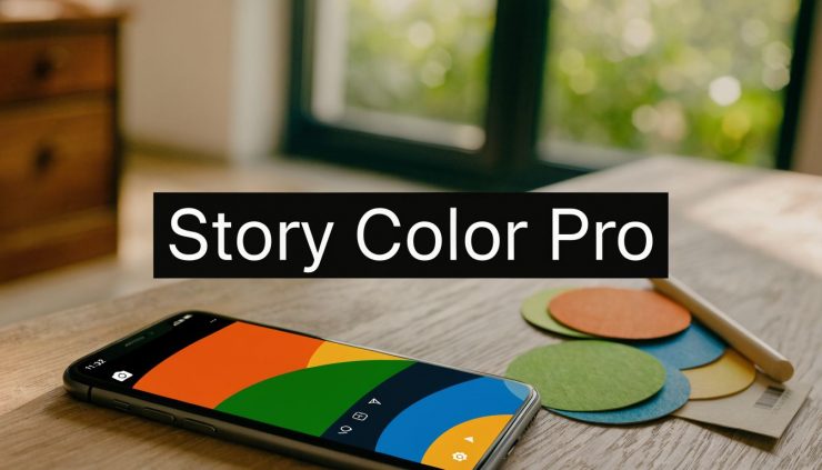
You open Instagram Stories to post a quick update, tap the color options, and hit the same wall again. The built-in presets are close to your brand, but not right. The auto-generated background behind your uploaded image looks muddy. The result feels like Instagram made the design decision for you.
That’s the point where many either settle for “good enough” or waste time rebuilding the same story from scratch every day. A better workflow exists. If you treat your instagram story color background as part of your brand system, not a last-second styling choice, Stories get faster to produce and easier to recognize at a glance.
Beyond the Default Why Your Story Background Matters
Instagram Stories stopped being a side feature a long time ago. They launched in 2016 and now reach over 500 million daily active users, making them a major surface for attention and brand recall. Marketing analyses also show that brands using custom solid color backgrounds see 25% higher retention rates than default options, while vibrant solids can improve visibility by up to 35% in A/B tests, according to this Instagram Stories background analysis.
That matters because background color does more than “look nice.” It decides whether your text is readable, whether your story frame feels on-brand, and whether a viewer instantly recognizes your content before reading a word.
Instagram’s native options are limited by design. In Create mode, you get a short preset list, which is fine for casual posting but weak for any team trying to match brand guidelines. If you upload a photo, Instagram often pulls in a background based on the image’s dominant hue. Sometimes that works. Often it doesn’t.
What the default background gets wrong
The default approach usually fails in three places:
- Brand mismatch: your approved brand color and Instagram’s nearest visual approximation aren’t the same thing.
- Weak hierarchy: text, stickers, and CTAs fight with the background instead of sitting clearly on top of it.
- Inconsistency across story series: one frame looks bright, the next muted, the third off-brand.
Practical rule: If your audience can’t recognize your story style in a second, your background system is too loose.
Consistency compounds. When every story uses the same visual logic, even quick posts feel intentional. That’s especially important if you’re publishing educational or recurring story formats alongside scheduled content. If you want a refresher on posting mechanics before refining design, this guide on how to share a story on Instagram is a useful baseline.
The Native Method for Perfect Solid Color Backgrounds
If you only need a clean solid fill, Instagram’s native editor is enough. The problem isn’t the tool. It’s that most tutorials stop at “long-press the screen” and skip the details that make the fill accurate and repeatable.

The expert-recommended method is straightforward: open the Draw tool, select the pen, choose your color, and long-press for 2 to 3 seconds for a complete fill. A short press is the common mistake and often creates an incomplete background. For brand accuracy, using the eyedropper on an uploaded color swatch is the critical move because it helps bypass Instagram’s color gamut compression, as explained in Tailwind’s guide to changing Instagram Story background color accurately.
The exact in-app workflow
Use this process when you need a reliable solid background without leaving Instagram:
- Open Stories and upload any temporary image.
- Tap the three dots menu.
- Choose Draw.
- Select the pen tool, not the highlighter.
- If you need a precise brand shade, upload a palette or swatch image first and use the eyedropper to sample the exact color.
- Press and hold in the center of the screen for 2 to 3 seconds.
- Release only after the full fill appears.
- Add text, stickers, links, or polls.
The uploaded image doesn’t matter if you’re covering the whole canvas. I often recommend keeping a simple phone album with brand swatches, campaign colors, and seasonal palettes so the eyedropper is always one tap away.
When to use the highlighter instead
The highlighter is useful when you want the image underneath to remain visible. It creates a translucent overlay rather than a full block of color. That’s useful for softening a busy photo so white text can sit on top without disappearing.
Use the pen when you want a blank canvas. Use the highlighter when the photo still needs to show.
A lot of “Instagram glitch” complaints are really timing issues. People tap and release too fast, then blame the app for a patchy fill.
Common failure points
Most bad fills come from process, not platform. Watch for these:
- Short presses: the app reads the gesture as a tap, not a full-fill command.
- Manual color guessing: the bottom palette can be visually close but still off-brand.
- Busy underlying images: if you’re trying to sample from a cluttered upload, the eyedropper can grab the wrong tone.
- Wrong tool selected: highlighter overlays and pen fills behave differently.
A simple fix is to keep one saved image that contains nothing except your approved brand colors. That removes guesswork and speeds up every story build.
Best use cases for native solid fills
The native method works best for quick-turn stories such as:
- Text-first updates: announcements, reminders, countdowns, and short tips.
- Poll frames: backgrounds that need strong contrast behind stickers.
- Minimal promo slides: one message, one CTA, one clean brand color.
It’s fast, it’s built in, and it works well when the design goal is clarity. Once you want layered gradients, motion, or more polished composition, native editing starts to show its limits.
Creating Advanced Gradients with Third-Party Tools
For anything beyond a flat fill, I stop designing inside Instagram. Native tools are fine for speed, but they’re not where I build polished gradients, textured backgrounds, or video-backed story frames.

A better approach is a pre-composited 9:16 export pipeline in Canva or Adobe Express. Agencies using this method for evergreen content report a 28% engagement lift, and the main reason is practical: subtle, well-designed gradients look more professional and create less visual distraction than native options, according to this guide to advanced Instagram Story background workflows.
The setup that saves rework
Start with the correct canvas. Story design should begin at 1080×1920 in a vertical 9:16 layout. That avoids awkward cropping and gives you predictable text placement.
Inside Canva or Adobe Express, build the background before you think about captions or stickers. The order matters. If the backdrop is unstable, every element on top becomes harder to place.
Use this workflow:
- Pick your base colors: choose approved brand shades first, then build the gradient around them.
- Keep gradients restrained: subtle transitions usually outperform loud, banded blends.
- Reserve negative space: leave room for text, link stickers, or product shots.
- Export before uploading: don’t rely on Instagram to recreate the effect live.
If you’re comparing app options, this roundup of third-party apps for Instagram is a good way to evaluate which tool fits your design stack.
A practical gradient build in Canva
Here’s a repeatable method that works well for brands that want a more refined look:
- Open a Story-size design in Canva.
- Add a background rectangle that fills the whole frame.
- Apply a linear or radial gradient using your chosen brand colors.
- If you’re using video, keep it visually subordinate to the text area so the background supports the message instead of competing with it.
- Drop in your recurring elements, such as title line, logo mark, sticker zone, or CTA area.
- Export as a still image or MP4, depending on the format.
- Upload from your camera roll into Stories.
A professional finish is attained. You’re not improvising inside the app. You’re controlling the composition before Instagram gets involved.
A video walkthrough helps if you want to see that in motion:
What native gradients still get wrong
Instagram’s live editing is convenient, but complex backgrounds can render unpredictably. That shows up as uneven transitions, awkward cropping, or overlays that look fine on one device and rough on another.
Third-party composition avoids most of that because you’re uploading a finished asset, not asking Instagram to build the effect in real time.
If a story background needs to look identical every time, create it outside Instagram and upload the final asset. Don’t leave brand presentation to a live editor.
The payoff is bigger than aesthetics. A polished background reduces friction for the viewer. The eye goes to the message faster, which is exactly what you want for evergreen tips, promo frames, and recurring story series.
Choosing a Background Color Strategy That Works
The right instagram story color background depends on what you want the viewer to do. “Use high contrast” is useful advice, but it’s incomplete. Color choice should match the audience, the goal, and the context of the story frame.
A 2025 analysis found that blue backgrounds (#007BFF) generated 18% higher replies for B2B audiences, while warm oranges drove 25% more swipe-ups in e-commerce. The same source also notes that, after Instagram’s adaptive theming rollout, near-black backgrounds increased view time by 32% when paired with neon text accents, according to this data-driven review of Instagram Story background performance.
Match color to the job
Not every story needs the same mood. The best-performing palette is often the one that fits the action you’re asking for.
| Goal | Background direction | Why it works |
|---|---|---|
| B2B education | Blue, especially #007BFF | Signals clarity and trust, and performed well for replies |
| E-commerce CTA | Warm orange | Creates urgency and energy for swipe-focused action |
| Night-mode visual style | Near-black with neon accents | Holds attention longer when executed with strong contrast |
If you’re designing around a brighter edge-lit look, a visual reference like this neon aesthetic gallery can help you define the accent style without making the whole frame feel chaotic.
Accessibility matters more than trendiness
A background can be on-brand and still fail if people can’t read what’s on top of it. That’s where a lot of stories go wrong. Teams choose a nice color, then layer thin white text over a pale gradient and call it done.
Use a simple rule. If the message is the point, readability wins every time.
Check these three things before publishing:
- Text contrast: white text on pale yellow, mint, or peach usually fails visually even if it looks stylish in the editor.
- Sticker visibility: polls, links, and question boxes need breathing room around them.
- Screen brightness reality: viewers aren’t all watching in perfect lighting conditions.
Build a small decision system
Teams typically don’t need an endless palette. They need a short list of approved choices tied to content types.
A practical setup looks like this:
- Primary brand color: use for announcements, brand statements, and core educational slides.
- Response-driving color: use for stories that ask a question, invite a DM, or push a poll.
- Promotion color: reserve for launches, limited-time offers, and product-led frames.
- Dark mode option: keep one near-black layout ready for high-contrast stories.
That gives you consistency without turning every story into the same visual.
Strong story design isn’t about picking your favorite color. It’s about picking the color that helps the message land fastest.
What works better than chasing every trend
Trend palettes come and go. Reusable color logic lasts. If your stories support a brand, use exact HEX values, define where each one belongs, and keep text styles consistent across the set.
I also recommend testing color in sequence, not in isolation. A single orange frame may perform well, but a full week of orange-heavy stories can fatigue the audience. Alternating between your trust color, promo color, and dark mode option usually creates a stronger visual rhythm.
The most useful background strategy is one your team can repeat without second-guessing. If every post starts with “what color should this be,” the system isn’t finished yet.
Build a Reusable Story Template System for Efficiency
Designing one good story is easy. Designing fifty without drifting off-brand is where systems matter.
The fastest teams don’t open Instagram and start from zero. They keep a small library of templates for the story types they publish most often. That turns the instagram story color background from a creative decision into a production asset.

Start with content categories, not layouts
The template system should follow your content mix. Build around what you post, not what looks nice in a design file.
Most brands can start with five categories:
- Quote or insight stories
- Tip or tutorial slides
- Promo or product announcements
- Engagement frames for polls or Q&As
- Link-driven stories for blog posts or offers
Each category should have its own background logic. A quote slide might use a minimal solid color. A promo frame may use a warmer color with stronger CTA placement. A tutorial slide often needs more negative space for multi-line text.
What to standardize inside each template
Reusable doesn’t mean rigid. It means the important choices are already made.
Standardize these elements:
- Background color rules: define the approved shades for each template.
- Text zones: know where headlines, body copy, and CTAs belong.
- Sticker placement: leave intentional space for polls, links, and question boxes.
- Logo treatment: decide whether a logo appears, where it sits, and when to omit it.
- Export settings: keep all files in Story dimensions so no one resizes manually.
I like to keep one “clean” version and one “busy week” version of each template. The clean file is fully editable. The busy-week file is almost done, so a manager can swap one line of text and post in minutes.
Organize templates so anyone can use them
A template library is only useful if the team can find the right file fast. Naming matters more than people think.
A simple structure works well:
| Folder | Example file name | Purpose |
|---|---|---|
| Quotes | quote-blue-minimal-v1 | Thought leadership or evergreen pull quotes |
| Tips | tip-dark-neon-v2 | Educational stories with strong contrast |
| Promo | promo-orange-cta-v1 | Sales or product pushes |
| Engagement | poll-solid-brand-v1 | Polls, questions, and sliders |
| Links | blog-gradient-soft-v1 | Traffic-driving story frames |
Version numbers help prevent “final-final-actual-final” file chaos. If you manage multiple brands, add the brand name at the start of every file.
For creators and social managers refining the broader stack around this process, these best tools for content creators are a useful complement.
Batch creation beats daily improvisation
The biggest time saver is batching. Instead of building backgrounds whenever a story is due, create several templates in one sitting.
A practical batching session might include:
- Pick your content categories for the month.
- Lock the color rules for each category.
- Build two to three template variations per category.
- Export and store them in a shared folder or design workspace.
- Document when each template should be used.
That gives you a controlled set of options without producing visual sameness.
The goal isn’t to automate creativity. It’s to automate the repetitive parts so your attention stays on message and timing.
Keep the system flexible
Template systems fail when they become too precious. If every story requires a designer to access a file, the workflow is broken.
The best libraries are modular. They let you swap colors, update a headline, add a sticker, and post. That’s especially useful for evergreen material, where the same core message may be repackaged several times with small adjustments.
When the background system is documented, anyone on the team can produce a story that looks intentional. That’s when design stops being a bottleneck and starts acting like infrastructure.
From Creative Chore to Strategic Advantage
A lot of teams treat Story backgrounds as a finishing touch. That’s why they keep running into the same problems: off-brand colors, weak readability, and too much design time spent on posts that disappear in a day.
A better approach is simple. Use the native Draw tool when you need a fast solid fill. Use Canva or Adobe Express when you need polished gradients or layered layouts. Choose colors based on audience and action, not habit. Then turn those decisions into a reusable template system.
That’s what makes background design useful instead of annoying. You’re not just picking a color. You’re building recognition, clarity, and speed into every story your team publishes.
If you’re also refining how paid partnerships, creator collaborations, or sponsored visuals should look in Stories, this overview of branded content on Instagram is worth reviewing so your visual system stays consistent across formats.
The payoff is practical. Posting gets faster. The brand looks sharper. And recurring story formats stop feeling like a daily reinvention project.
If you want to turn that template system into a repeatable publishing workflow, EvergreenFeed helps automate evergreen social content through Buffer so your best Story-supporting posts, promos, and content categories keep moving without constant manual scheduling.