Leiann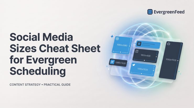
Wrong dimensions can turn a strong evergreen post into a cropped headline, an unreadable CTA, or a blurry asset that looks dated before it ever reaches the queue. The fix is not memorizing every platform’s full specification sheet. It is building a small set of reliable source canvases, then checking the placement before each post recurs.
This social media sizes cheat sheet focuses on the formats content teams use most often for evergreen scheduling. Keep it beside your design workspace and social media calendar checklist, but remember: pixel dimensions get the post delivered correctly. Safe zones, message clarity, and a sensible rotation plan are what make it worth seeing again.
Start with the universal social media size rules
Use pixels for social media design. Inches and centimeters only matter when you are preparing something for print; on a screen, the pixel dimensions and aspect ratio determine how the platform displays your work.
Start every export with these must-do checks:
- Export at the recommended pixel dimensions. A 1080 px-wide image is a practical baseline for many social placements because it is sharp enough for modern mobile screens without being unnecessarily heavy.
- Match the aspect ratio to the placement. A 4:5 feed image, a 1:1 square, and a 9:16 vertical video may carry the same message, but they are not interchangeable canvases.
- Keep critical content away from the edges. Headlines, faces, product details, logos, and CTAs should sit within a comfortable inner margin so interface overlays and feed crops do not obscure them.
- Export for clarity, not maximum file size. Platforms compress uploads. A clean, properly sized source file usually survives compression better than a huge file that has already been repeatedly saved and resized.
The largest native file is not always the safest design file. Platforms can crop previews differently on mobile, desktop, profile grids, shared links, and third-party scheduling tools, so build for the intended placement rather than assuming one upload will look identical everywhere.

Use these master canvases for evergreen scheduling
For most teams, three master canvases cover the bulk of recurring social creative. Build each message in the ratio that fits its primary destination, then create a deliberate variant when another platform would crop the layout or weaken the idea.
1080 x 1350 px: the vertical feed default
Use 1080 x 1350 px for 4:5 vertical feed posts. This is the essential default for Instagram portrait feed creative because it takes up more vertical space on a mobile screen than a square post. It also works well as a source format when your message benefits from a strong headline, a product image, and room for supporting detail.
Do not blindly send this asset to square-only placements or full-screen video placements. A 4:5 design can lose side content in a square crop and leave awkward empty space or poorly positioned text in 9:16.
1080 x 1080 px: the cross-platform square fallback
Use 1080 x 1080 px when one asset must travel across several feed queues. The 1:1 ratio remains a dependable choice for Facebook, Instagram feed, LinkedIn, and X. It is especially useful for evergreen tips, quotes, simple proof points, and branded graphics that need a single reusable layout.
The tradeoff is visibility: a square usually occupies less mobile feed space than a vertical 4:5 image. Use it for efficiency, not because it is automatically the best-performing format.
1080 x 1920 px: full-screen Stories, Reels, and TikTok
Use 1080 x 1920 px for 9:16 full-screen content. This is the standard canvas for Stories, Reels, TikTok videos, and YouTube Shorts. It gives video and motion graphics room to breathe, but it also brings interface controls, captions, profile details, and buttons into the frame.
Create separate versions when overlays, captions, faces, product details, or CTAs could be covered. A shared 9:16 canvas does not mean Stories, Reels, and TikTok have identical safe placement.

Instagram sizes checklist
Instagram rewards format discipline. Prioritize feed portrait posts, carousels, and 9:16 video first; these are the formats most likely to appear in a recurring content plan.
Instagram feed posts and carousels
- Create portrait feed posts at 1080 x 1350 px (4:5). This is the strongest general-purpose feed size when you want more mobile screen space without moving into a full-screen format.
- Create square feed posts at 1080 x 1080 px (1:1). Use squares for simple cross-platform graphics and reusable evergreen posts that also need to work on Facebook or LinkedIn.
- Create landscape feed posts at 1080 x 566 px (about 1.91:1). Reserve this format for visuals that genuinely need width, such as wide charts or screenshots. It has less feed presence on mobile.
- Keep every carousel slide in one orientation. Choose portrait, square, or landscape at the start and use it consistently. Mixed dimensions create poor crops and an uneven swipe experience.
Instagram Stories and Reels
- Export Stories and Reels at 1080 x 1920 px (9:16). Keep important text, logos, and CTAs in the central area rather than near the top and bottom, where interface elements can overlap.
- Design a Reel cover separately. A full-screen video frame may be legible while playing but fail as a small feed or profile-grid preview. Give the cover one clear focal point and readable type.
- Do not assume Story-safe text is Reel-safe text. Both use the same canvas, but their controls and caption behavior differ. Preview each destination before adding it to a recurring schedule.
Facebook sizes checklist
Facebook still supports a broad mix of feed images, shared links, video, Events, and Page assets. Treat a link preview as its own format rather than assuming your standard post image will control its appearance.
Facebook feed posts, links, and video
- Create standard feed images at 1080 x 1080 px. Square posts are a safe, flexible choice for recurring Facebook feed updates and generally hold up well across devices.
- Prepare link imagery at 1200 x 630 px. This 1.91:1 format is useful for shared link visuals, but the preview may be controlled by the destination page’s Open Graph image rather than the image attached to your social post.
- Use 1080 x 1920 px for Stories, Reels, and vertical video. Protect the center of the frame and check that any on-screen copy remains clear above interface overlays.
- Build Event covers and Page assets as placement-specific designs. They are branding surfaces, not just another feed crop. Check current crop behavior on both mobile and desktop before publishing.
- Preview recurring posts on mobile. A feed crop that looks harmless in a scheduler preview can cut off a headline or make a link card look disconnected from the caption.
LinkedIn sizes checklist
LinkedIn social media sizes deserve their own workflow. Professional audiences often respond well to readable, text-first graphics, useful document posts, and practical frameworks. Simply shrinking an Instagram graphic is usually the wrong approach.
LinkedIn feed images and document posts
- Use 1200 x 1200 px or 1080 x 1080 px for square feed images. Both work well for single-image posts, provided type is large enough to read on a phone without zooming.
- Use 1200 x 627 px for link-preview-friendly creative. This ratio aligns with common horizontal preview treatment, though you should verify the actual preview after publishing because the linked page controls much of it.
- Create document posts as well-spaced PDF pages. A practical workflow is to design portrait pages around 1080 x 1350 px or a standard document proportion, then export a PDF. Keep one idea per page and allow generous margins.
- Design profile and Company Page covers separately. These assets crop differently from feed images and should not carry essential small text near their edges.
- Use larger type than you think you need. LinkedIn document pages and feed graphics are often read quickly on mobile. Clear hierarchy beats dense, presentation-style slides.
X, Pinterest, TikTok, and YouTube sizes checklist
These networks serve different consumption habits, so avoid forcing a standard feed graphic into every destination. Pinterest Pins and YouTube thumbnails are usually purpose-built assets, while X benefits from clear horizontal visuals and concise copy.
X and Pinterest
- Create X images at 1600 x 900 px or 1200 x 675 px. Both are 16:9-friendly choices for post images and link-related visuals. Keep small text away from the edges because feed previews can crop unexpectedly.
- Create standard Pinterest Pins at 1000 x 1500 px (2:3). Pins are designed for vertical browsing, so give the visual a clear benefit-led headline, useful image, and branded but unobtrusive source cue.
- Do not treat a Pin as a tall Instagram post. Pinterest is more search and save oriented. Design for a lasting promise, a clear topic, and a visual that makes someone want to return to it later.
TikTok and YouTube
- Export TikTok videos at 1080 x 1920 px (9:16). Keep opening text and key visual moments inside the central safe area, especially when a hook appears in the first seconds.
- Export YouTube Shorts at 1080 x 1920 px (9:16). The same canvas works, but do not reuse a TikTok version without checking captions, branding, and any platform-specific references.
- Create YouTube thumbnails at 1280 x 720 px (16:9). A thumbnail is a click decision asset, not an in-video frame. Use one readable focal point and avoid trying to summarize the entire video in tiny text.
Check safe zones before scheduling any recurring post
Social media sizes and safe zones are related but not identical. Correct dimensions prevent obvious resizing problems; safe zones prevent your important content from colliding with platform UI, profile crops, captions, and inconsistent previews.
- Protect the top and bottom of vertical video. Keep the hook, title, product claim, and CTA away from areas likely to hold account names, captions, buttons, and navigation controls.
- Leave side margins on feed graphics. Edge-to-edge text is fragile. A modest inner margin protects the design when the platform uses a different crop in search, a profile grid, or a shared preview.
- Keep logos and CTAs in the visual center. A logo can help recognition when used subtly and consistently, but it should never crowd the safe zone or substitute for useful content.
- Protect corners on square posts. Corners are common places for decorative elements, but they are risky places for critical labels, dates, discount details, or navigation cues.
- Prioritize one focal point on thumbnails. Thumbnails need to communicate at a glance. A face, product, outcome, or short headline works better than several competing elements.

Build an evergreen asset library by ratio, not by network
A static social media post size chart helps once. A ratio-based asset library helps every week. Store a source design and exported versions together so your team can find the right creative without recreating the same post for every queue. For a broader comparison of scheduling tools, consider how each one handles recurring content alongside these format requirements.
Use a consistent file name such as campaign-message-ratio-version. For example: spring-guide-email-tips-4×5-v2. The name should tell a future teammate what the asset says, where it fits, and whether a newer version exists.
Organize content buckets by intent: educational, promotional, proof, seasonal, and community. Each bucket should contain enough ratio-specific assets for the accounts and placements it serves. Seasonal posts also need clear expiry dates so they do not reappear months after the offer or event has passed.
Map each evergreen post to its destination and format
Maintain a simple record for every repeatable post. This separates creative decisions from scheduling decisions and makes refreshes much easier.
- Record the platform and placement. “Instagram feed” and “Instagram Reel” are not interchangeable destinations, even if they promote the same resource.
- Record the asset ratio and file version. This prevents an old square graphic from being used where a newer 4:5 version exists.
- Record the caption version and link. A platform-specific caption may need a different hook, social media handle, or CTA than the original cross-posted copy.
- Set an expiry or review date. Review claims, prices, screenshots, dates, product details, and external links before the post returns to the queue.
- Mark whether the asset has been refreshed. A visual can remain evergreen while its wording, branding, or landing-page promise needs an update.
Review duplicate copy and repeat frequency separately from image dimensions. An asset can be technically perfect at 1080 x 1350 px and still underperform because the audience has seen the same wording too often. A social media schedule example can help translate the asset library into a practical rotation.
EvergreenFeed

EvergreenFeed is built for the recurring side of this workflow: organizing evergreen posts in content buckets and adding randomly selected posts to Buffer queues on schedules set by account, category, weekday, and time. It is a good fit for Buffer users who have format-ready assets and want their educational, promotional, and proof content to rotate without manually rebuilding the queue every week.
The important limitation is scope: it is not a broad social media management suite or a design tool. You still need to create the correct variants, write platform-appropriate captions, and decide when an old post deserves a refresh. Choose it when Buffer is already part of your process and repeatable evergreen distribution is the problem you need to solve.
Run this pre-schedule quality check
Use this short check before a post enters a recurring queue. It catches the problems that matter most after a post has been scheduled across several accounts and dates.
- Verify the pixel dimensions and ratio. Confirm the exported file matches the actual destination, not merely the platform it belongs to.
- Inspect the mobile crop. Preview the image or video where people are most likely to see it, especially for portrait feed posts and vertical video.
- Confirm safe-zone placement. Make sure the CTA, logo, speaker, product detail, and main headline remain visible around interface overlays and likely crops.
- Check readability at feed size. If the key message cannot be understood in a quick scroll, simplify the copy, enlarge the type, or reduce competing elements.
- Validate every link. Test the destination, check the preview where relevant, and make sure campaign pages, offers, and UTM details are still current.
- Tailor captions and handles. Adjust the hook, mentions, hashtags, and CTA for the platform rather than pasting the exact same copy everywhere.
- Confirm the post is still current. Retire outdated claims, old screenshots, expired promotions, and references that no longer fit your brand or audience.
To make social media posts engaging, lead with a clear hook, use one visual focal point, and make the graphic and caption support the same idea. Then ask for one appropriate action: save the tip, read the guide, reply with an opinion, or visit the resource. Multiple competing asks usually weaken the post.
Measure value against the post’s purpose. Saves and shares can indicate useful educational content; clicks and qualified traffic matter for resource promotion; replies can reveal community interest; conversions matter for commercial posts. Likes are useful context, but they are not a complete measure of performance.
Know what social posts can and cannot do for SEO and research
Social media matters because it extends the useful life and reach of good content. A recurring post can put a durable guide, case study, product lesson, or video in front of new people, produce engagement, and send qualified referral traffic back to your site.
For research, a social post can be a primary or secondary source depending on who published it and what it documents. A firsthand statement from an organization or eyewitness may be primary evidence; commentary about an event is secondary. Verify the account, preserve context, and archive important material rather than relying on a screenshot without a source trail.
The terminology changes by platform: people may call them posts, updates, status updates, Pins, videos, Reels, or Tweets/posts. The production discipline does not change: match the format to the placement, protect the message, and make every recurring asset earn another appearance.
Keep this social media sizes cheat sheet beside your scheduling calendar
- Choose the right master ratio. Start with 4:5 for vertical feed creative, 1:1 for flexible cross-posting, and 9:16 for full-screen video.
- Export in pixels. Do not design social assets around inches or centimeters unless the asset is also intended for print.
- Protect safe zones. Keep essential text, faces, logos, and CTAs away from likely crop edges and interface controls.
- Create platform-specific variants when needed. Make a new version whenever cropping would weaken the message or obscure an important detail.
- Preview the actual placement. A scheduler thumbnail is useful, but a mobile feed or link preview is the final test.
- Refresh evergreen assets before they recur. Review performance, relevance, links, offers, and creative fatigue on a regular schedule.
Dimensions are a delivery requirement, not a content strategy. Your message quality, audience relevance, and rotation rules determine whether an evergreen post keeps performing after its first run.
Teams using Buffer can use EvergreenFeed to organize format-ready content in buckets and add it to account- and category-based recurring schedules.