
To really get a grip on your content's performance, you first have to tie every single piece back to a clear business goal. This is about shifting your focus away from feel-good numbers like page views and zeroing in on metrics that actually move the needle for your business, like generating solid leads or keeping customers around longer.
Setting the Stage for Smart Measurement
Before you even dream of opening an analytics dashboard, your first job is to define what "success" actually looks like for you. Without a clear target, you're just collecting numbers in the dark. The real goal is to trade vague wishes like "more traffic" for concrete, measurable outcomes that directly prop up your business.
This groundwork is what makes your measurement efforts truly matter. Think about it: a B2B SaaS company might not care much about the view count on a new blog post. For them, success is how many of those readers sign up for a product demo. An e-commerce brand, on the other hand, might judge a new video's performance on how it bumps up the average order value or a customer's lifetime value.
Asking the Right Questions
It all starts with a bit of honest self-reflection. To connect your content to tangible business results, you have to ask some sharp questions that cut to the heart of what you're trying to achieve.
Here are a few to get you started:
- What business objective does this piece of content serve? (e.g., boosting brand awareness, generating qualified leads, improving customer retention, or directly driving sales).
- What single action do we want someone to take after they engage with this? (e.g., download an ebook, subscribe to our newsletter, request a demo, or complete a purchase).
- Who are we talking to, and what does a 'win' look like from their perspective? (e.g., getting a quick, reliable answer to their problem, or feeling more confident about buying from us).
This way of thinking breaks down the overwhelming task of "measurement" into smaller, more manageable goals. In fact, a study of 1,200 successful researchers found that those who break their process into smaller tasks are 72% more likely to finish projects on time. That same principle is incredibly effective when you apply it to content strategy. You can explore these productivity insights from the full study.
From Business Goals to Content Goals
Once you have those answers, you can start translating those big-picture business objectives into specific, actionable content goals. This is where measurement gets its power. For example, if your company's main objective is to capture more market share, a related content goal might be to outrank your competitors for specific, high-intent keywords they currently dominate.
This is a great time to map out exactly how your content goals line up with the bigger business objectives. Using a simple framework like Objectives and Key Results (OKRs) can bring a lot of clarity.
Connecting Content Goals to Business Objectives
This table shows how you can translate common content goals into specific, measurable business objectives and their key results (OKRs).
| Business Objective | Related Content Goal | Example Key Result (KR) |
|---|---|---|
| Increase lead generation by 15% | Create high-value, gated content | Achieve 500 downloads of our new ebook in Q3. |
| Improve customer retention by 10% | Develop a customer-focused resource hub | Decrease support tickets related to "how-to" questions by 20%. |
| Boost brand authority in the industry | Publish original research and data-driven insights | Earn 25 high-quality backlinks to our annual industry report. |
| Drive a 5% increase in online sales | Create product-focused tutorials and case studies | Increase the conversion rate from blog posts to product pages by 8%. |
Mapping these connections ensures every piece of content has a clear purpose and a measurable impact on the company's bottom line.
My Takeaway: Every article, video, or social media post needs a job. If you can't say exactly what that job is and how it helps the business, you'll never be able to measure if it's actually working.
Putting in this planning time upfront keeps you from drowning in a sea of vanity metrics. It forces you to concentrate on the data that truly shows how your content is contributing to growth, making your insights sharper and your entire strategy more effective.
Choosing KPIs That Actually Drive Decisions

Okay, so you’ve set your goals. Now for the fun part: picking the right Key Performance Indicators (KPIs). Think of it this way: a KPI isn't just another number on a dashboard. It's the specific metric that tells you, without a doubt, if you’re actually making progress toward your goal. It’s incredibly easy to get lost in a sea of data, but focusing on a handful of smart KPIs is what transforms analytics from a confusing mess into a strategic roadmap.
The secret is to tie every KPI you track back to one of three core areas: Engagement, Conversion, or Loyalty. Each one tells a different, crucial part of your content's story.
Pinpointing Your Engagement Metrics
Engagement metrics get right to the point. They answer a simple but vital question: is anyone actually paying attention? They show you how deeply your audience is interacting with the content you worked so hard to create.
This isn't just my opinion; it’s a global trend. A recent analysis found that 53% of marketers worldwide now see social media and website engagement as their top way to gauge content effectiveness. You can dig deeper into these content performance statistics to see just how much things are shifting.
So, what should you watch?
- Average Time on Page: How long are people sticking around? If you have a 2,000-word article with a 30-second average time on page, you've got an intro problem.
- Scroll Depth: This is a personal favorite. It tells you how far down the page people are actually getting. It's the best indicator of whether your formatting, subheadings, and storytelling are keeping them hooked.
- Comments & Social Shares: These are your content’s applause. When someone takes the time to comment or share, it means you’ve said something that truly resonated.
Tracking Crucial Conversion Metrics
This is where the rubber meets the road. Conversion metrics show how your content contributes directly to your business's bottom line by tracking the actions that move a reader closer to becoming a customer. They prove your content isn't just a "nice-to-have"—it's an engine for growth.
My Takeaway: Vanity metrics like page views feel good, but conversion metrics pay the bills. I'd rather have one lead magnet download from the right person than a thousand anonymous page views any day of the week.
Here’s what you should be laser-focused on:
- Lead Magnet Downloads: How many people are grabbing your ebooks, checklists, or whitepapers? This is a direct measure of trust and intent.
- CTA Click-Through Rate: What percentage of users are clicking your calls-to-action? Whether it's a "Request a Demo" button or a link to a product page, this tells you if your offer is compelling.
- Newsletter Signups: This is a clear signal that a reader wants to hear from you again, turning a casual visitor into a potential long-term relationship.
Measuring Long-Term Loyalty
Finally, loyalty metrics help you see the bigger picture. Are you just attracting a revolving door of one-time visitors, or are you building a dedicated audience that keeps coming back for more? Sustainable growth is all about retention, and these KPIs are your window into that.
Loyalty is all about repeat behavior. Keep an eye on these:
- Returning Visitor Rate: What percentage of your traffic is from people who have been there before? A high rate is a fantastic sign that you’re building a true community.
- Session Duration: Pay close attention to this for returning visitors. Longer sessions suggest they see your entire content library as a valuable, trustworthy resource, not just a one-hit wonder.
- Brand Mentions: Go beyond linked mentions. When people talk about your brand on social media or in forums without even linking, you know you're becoming a genuine part of the conversation in your industry.
Assembling Your Content Analytics Toolkit

Knowing which KPIs to track is just half the battle. You also need the right tools to actually measure them. But let’s be clear: you don’t need to break the bank on a dozen complex platforms to get the job done. A few essential tools, when used thoughtfully, can give you a crystal-clear picture of what’s hitting the mark and what’s falling flat.
The idea is to build a lean, effective analytics stack that delivers actionable insights without creating information overload.
The Foundational Trio
For most businesses, the foundation of a solid analytics setup rests on three free, incredibly powerful platforms. When you use them together, they tell a comprehensive story about your content's journey and impact.
- Google Analytics 4 (GA4): This is your command center for understanding on-site user behavior. It’s the tool that answers fundamental questions like, "How did people find our website?" and "What pages are they looking at once they arrive?"
- Google Search Console (GSC): GSC is absolutely essential for anyone serious about organic search. It shows you the exact search terms people use to find your content and flags technical SEO issues that could be hurting your rankings.
- Native Social Media Analytics: For tracking social performance, go straight to the source. Tools like Meta Business Suite or LinkedIn Analytics provide the most accurate data for their respective platforms. Third-party aggregators can be convenient, but they often lack the granular detail you get from the native tools.
These three give you a robust baseline for traffic, engagement, and acquisition. For a more exhaustive look at other options, you can explore our complete guide to content marketing analytics, where we cover more advanced tools and strategies.
Going Deeper with Specialized Tools
While that core trio is non-negotiable, a couple of specialized tools can unlock a whole new dimension of insight. They help you see how users interact with your pages and keep an eye on your competitive environment in ways standard analytics simply can't.
One of the best investments you can make is in a heatmap tool.
I’ve found that tools like Hotjar are absolute game-changers. They create visual maps showing exactly where people click, move their mouse, and scroll on a page. It's one thing to see a low click-through rate in a spreadsheet; it's another thing entirely to watch a recording of ten different users scrolling right past your main call-to-action button.
This kind of visual feedback is gold. It helps you quickly spot confusing navigation, weak copy, or poor design choices that are dragging down your performance.
Keeping Tabs on Your SEO Footprint
Beyond what happens on your site, you need to understand how your content performs out in the wild—specifically, in search results. This is where dedicated SEO platforms prove their worth, helping you measure the long-term impact of your work.
Platforms like Ahrefs or Semrush are built to track crucial SEO metrics that connect your content efforts to your search visibility.
- Keyword Rankings: Are you climbing the search results for your most important terms?
- Backlink Profile: Who is linking to your content? Backlinks are a powerful signal of your content's authority and value.
- Competitor Analysis: What are your rivals ranking for? Where are their content gaps you can exploit?
This data provides the crucial link between the content you publish and your actual presence on the search engine results page.
Making Sense of the Numbers: How to Find Actionable Insights
So you’ve got the data. Now what? Raw numbers are just that—numbers. The real magic happens when you start piecing them together to tell a story about what’s working, what’s falling flat, and, most importantly, why. This is where you put on your detective hat, connecting the dots between different metrics to spot problems and uncover opportunities you might have otherwise missed.
Think about a common scenario: a blog post is getting tons of traffic, but the conversion rate is practically zero. If you only looked at the traffic, you’d be patting yourself on the back. But when you pair it with the abysmal conversion data, it’s a red flag. Is the call-to-action buried or uninspired? Does the content actually deliver on the promise of its headline? Or is the page so slow to load that people are bouncing before they even get a chance to convert? This is what data interpretation is all about—looking for the context behind the numbers.
This simple guide can give you a solid starting point for setting performance benchmarks based on the type of content you're creating.
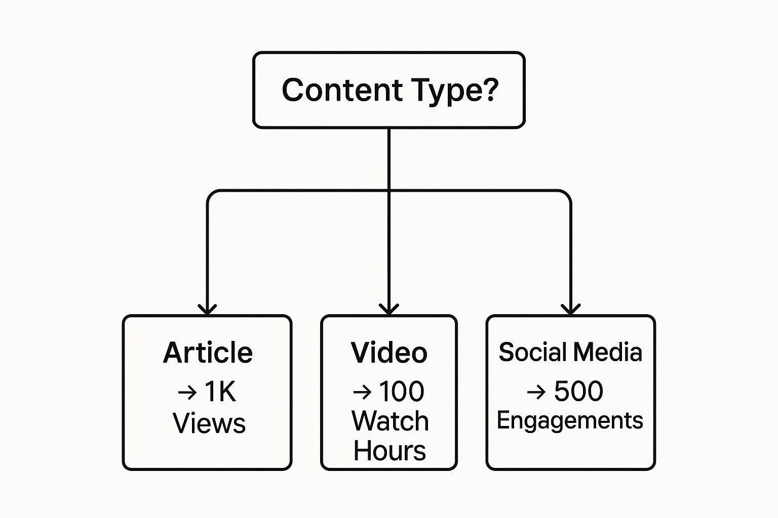
Using a format-specific benchmark like this from the get-go keeps you from comparing apples to oranges. It’s a simple way to ensure you’re measuring performance fairly across your different content efforts.
From Diagnosis to Action
Once you've identified a pattern, it's time to form a hypothesis and put it to the test. Let's go back to that high-traffic, low-conversion article. A good hypothesis might be, "The CTA at the end of the post is being overlooked because the copy is weak and the button doesn't stand out."
So, what do you do? You experiment.
- You could rewrite the CTA copy, shifting from a generic "Click Here" to something more benefit-focused like "Get Your Free Template."
- Maybe you change the button color from a muted gray to a vibrant orange to create better visual contrast.
- You might even add a second CTA partway through the article for readers who don't make it to the end.
After you've made your changes, you let it run for a couple of weeks and watch the numbers. If the conversion rate ticks up, you were right. If not, it’s back to the drawing board with a new hypothesis—perhaps the offer itself is the problem, not how you present it. This cycle of testing and learning is how data fuels real, strategic improvements. For a deeper look at this process, check out our guide on https://www.evergreenfeed.com/blog/content-performance-analysis/.
Uncovering Your Hidden Gems
Sometimes, the data will point you toward an unexpected win. You might notice that your case studies get far less traffic than your blog posts but generate a massive share of your best leads. This is a classic "quality over quantity" discovery.
This isn't just a gut feeling; it’s a well-documented phenomenon.
An analysis of 10,000 agency websites found that those using case-study-driven content see 167% higher conversion rates. What’s more, their detailed success stories led to 43% shorter sales cycles.
That kind of insight is pure gold. It gives you a clear signal on where to invest more of your time and resources. The action isn't just "let's make more case studies." It's "we need to create more in-depth case studies that speak directly to prospects in the final stages of their buying journey."
Of course, to spot these wins, you need to trust your numbers. A crucial part of that is understanding exactly how to calculate conversion rate correctly. By turning observations into concrete actions, you build a powerful feedback loop where every piece of data makes your content strategy smarter and more effective.
Interpreting Common Data Patterns
Trying to figure out what your analytics are telling you can feel like reading tea leaves. To help, I’ve put together a quick troubleshooting guide. This table breaks down common data patterns, what they might mean, and what you can do about them.
| Data Observation | Potential Meaning | Recommended Action |
|---|---|---|
| High Traffic, High Bounce Rate | Your headline and meta description are great, but the content isn't delivering. | Realign the content to match the headline's promise. Improve page load speed and add engaging visuals. |
| Low Traffic, High Engagement (Time on Page) | You've created a valuable piece of content, but not enough people are finding it. | Invest in promotion: share on social media, build internal links to it, and look for backlink opportunities. |
| High Traffic, Low Conversion Rate | The content is attracting an audience, but the call-to-action isn't working. | A/B test your CTA copy, design, and placement. Ensure the offer is relevant to the content. |
| High Open Rates, Low Click-Through Rates (Email) | Your subject line grabbed their attention, but the email body failed to persuade. | Strengthen your email copy, clarify the value proposition, and make the CTA button more prominent. |
| Lots of "Likes," Few Website Clicks (Social Media) | The post is popular on the platform but isn't driving traffic to your site. | Make sure the link is easy to find and the copy explicitly encourages a click. Test different formats (e.g., link post vs. image with link in caption). |
Think of this table as a starting point. Your data tells a unique story, and the context of your business and audience is everything. Use these patterns to form your own hypotheses and start testing your way to better results.
Turning Data into Growth: How to Optimize and Report on Content Performance

Measuring your content's performance isn't just about hitting a target and moving on. It's a living, breathing process—a feedback loop that constantly fuels your strategy. After you’ve dug into the data, the real work starts. This is when you translate those numbers into actions that actually drive growth. This cycle of reporting and optimizing is what separates a static content library from a dynamic marketing engine.
First things first, get into a reporting rhythm. For most teams, a monthly deep dive works perfectly for strategic reviews. It’s enough time to see real trends without letting things slide. For communicating with leadership or executives, a higher-level quarterly report that highlights major wins and progress toward business goals is usually best. The key is to tell a story with your data, explaining not just what happened, but why it matters.
From Insights to Actionable Optimizations
Once you have your performance story straight, it's time to roll up your sleeves and optimize. This is the fun part, where you use your findings to make your existing content better and your future content smarter. It’s easy to get caught in the "new, new, new" content trap, but some of your biggest wins are hiding in the content you’ve already published.
So, how do you put these insights to work? Here’s a framework I’ve used time and again:
- Refresh Your Hidden Gems: Go find the articles that have potential but aren't quite there—think content ranking on the second page of Google or pieces with decent impressions but low clicks. Give them a refresh. Update the stats, add sharper visuals, and tighten up the on-page SEO.
- Double Down on Your Winners: Identify your all-stars. These are the posts driving the most traffic, leads, or conversions. What makes them special? Was it the format? The topic? Whatever it is, do more of it. If a specific case study knocked it out of the park, create another one targeting a different vertical.
- Prune the Dead Wood: Let's be honest—not every piece of content is a winner. Some articles just don't connect, and no amount of tweaking will change that. It’s okay to let them go. Pruning or redirecting old, irrelevant posts can actually improve your site's overall authority. This is just one of many ways to avoid the common marketing mistakes startups make.
This isn't just a marketing-specific idea. Think about it: even academic researchers who actively promote their work see an average of 189% more downloads and a 76% higher chance of being cited. The lesson is clear: creation is only half the battle.
Your content analytics dashboard isn't a report card; it's a roadmap. Use it to find the best routes to your goals, spot the dead ends, and even discover a few scenic detours that end up being your most valuable journeys.
Building a Smarter, Data-Informed Content Calendar
Finally, close the loop by letting your performance data shape your future content. The insights you’ve gathered shouldn’t just live in a report; they should become the foundation of your editorial calendar.
For instance, maybe you discover that your in-depth "how-to" guides consistently generate more newsletter sign-ups than your quick-read listicles. The path forward is obvious: invest more time and resources into creating those practical, step-by-step tutorials your audience clearly loves. This data-driven approach means you're no longer guessing. You're building a content plan based on what you know works, turning measurement into a powerful engine for predictable growth.
Answering Your Content Performance Questions
Even the most seasoned pros have questions when it comes to measuring content performance. Let's tackle some of the most common ones that come up time and time again.
What’s the Real Difference Between a Metric and a KPI?
This is a classic point of confusion, but it's simpler than it seems. Think of a metric as any data point you can track. We're talking about things like page views, social media likes, or email open rates. There are literally hundreds of them.
A Key Performance Indicator (KPI), on the other hand, is a metric you've hand-picked because it directly tells you if you're getting closer to a crucial business goal. For instance, if your goal is to generate leads, then "new demo requests from the blog" is a KPI. All KPIs are metrics, but only a select few earn the title of KPI.
My Takeaway: Don't get lost in a sea of metrics. A metric tells you what happened. A KPI tells you if what happened actually matters to your bottom line.
How Often Should I Actually Be Checking My Content Performance?
There’s no magic number here; the right reporting schedule really depends on your goals and your audience. But over the years, I've found a balanced approach works best.
- Weekly Pulse-Checks: A quick, informal look at your main KPIs (like traffic to a new campaign page) is great for catching major problems or big wins right away.
- Monthly Deep Dives: This is the sweet spot for most teams. It gives your content enough time to collect meaningful data, so you can spot genuine trends and make smart tweaks to your strategy.
- Quarterly Business Reviews: These reports are for leadership and key stakeholders. They focus on the big picture, connecting your content's performance to major business objectives and demonstrating real return on investment.
How Can I Measure the ROI of My Top-of-Funnel Content?
This is the million-dollar question. Trying to draw a straight line from a single blog post to a sale that happens months later is a tough, often frustrating, game.
Instead of chasing a perfect ROI number, shift your focus to how your top-of-funnel content contributes to the overall customer journey. Look for leading indicators that prove your content is doing its job of building an audience and nurturing trust.
Track metrics like:
- Growth in organic traffic to your educational articles.
- Improved keyword rankings for your core topics.
- Newsletter sign-ups coming from your blog's calls-to-action.
- Assisted conversions in Google Analytics, which show how many times a piece of content was part of a visitor's path to converting later on.
These numbers demonstrate that your content is successfully building the audience that will eventually become customers.
What Are the Biggest Mistakes People Make?
The most common trap I see is getting hung up on vanity metrics. Celebrating a huge spike in traffic is great, but it's meaningless if none of those visitors are the right fit for your business.
Other frequent missteps include not tying content efforts to clear business goals from the start, getting overwhelmed by using too many different analytics tools, and—the most critical error—collecting piles of data but never actually acting on it to improve your strategy.
Ready to put your evergreen content on autopilot and get your time back? EvergreenFeed works with Buffer to keep your social media feeds buzzing with your best content. Stop scheduling posts by hand and start growing your audience effortlessly. Sign up for free and start automating today!